← BACK TO WORK

Brand Identity & Spatial Design

Willow

Willow finds harmony in contrasts — East Asian tradition and contemporary expression, bold flavours and quiet restraint. Inspired by the rhythm of the seasons, the identity embraces generous negative space and refined graphic elements, reflecting a cuisine where every detail is deliberate and every ingredient has its place.

Creative Direction
Norman Hartono
Graphic Designers
Faiye del Rosario, Venus Loh, Dillon Tan
Drafting & Build
FIDE ID Pte. Ltd.
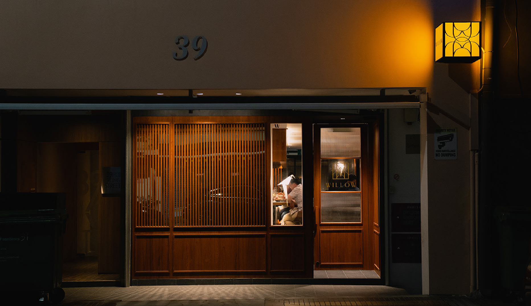
Willow restaurant exterior at night — warm amber timber-slat facade at 39 Hong Kong Street, glass entry door with gold WILLOW badge mark, custom lantern sconce casting a halo glow

01Interiors / Spatial Design

Spatial Design
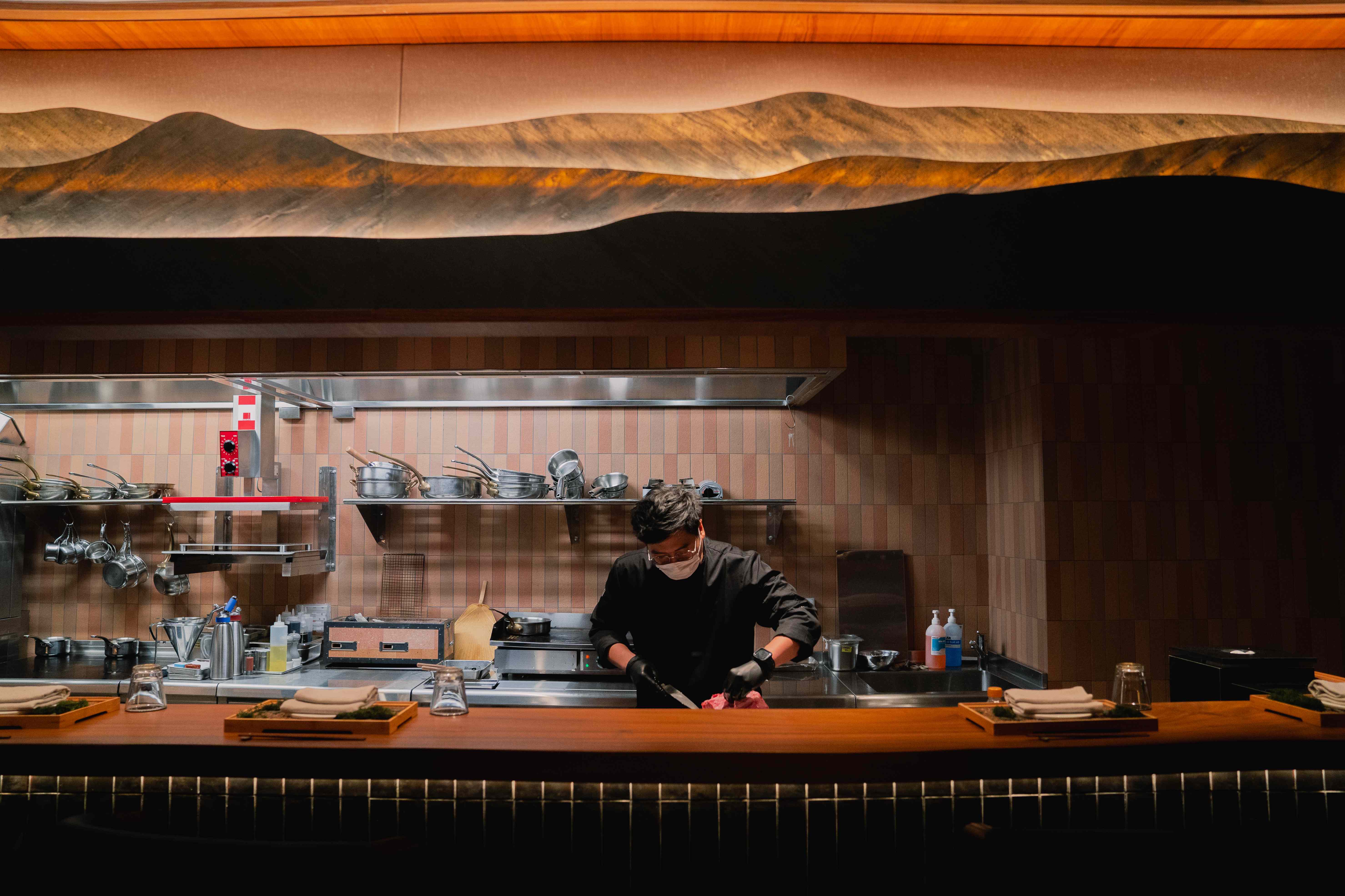
Willow open kitchen — chef in black preparing at the pass, pink-terracotta mosaic tile splashback, undulating hand-sculpted mountain-form sculptural canopy in warm amber above
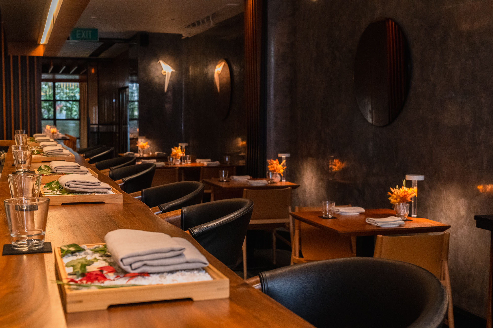
Willow full dining room — long timber omakase counter with black barrel chairs and oshibori trays, dark venetian plaster walls, origami bird sconces and round mirror discs, orange florals
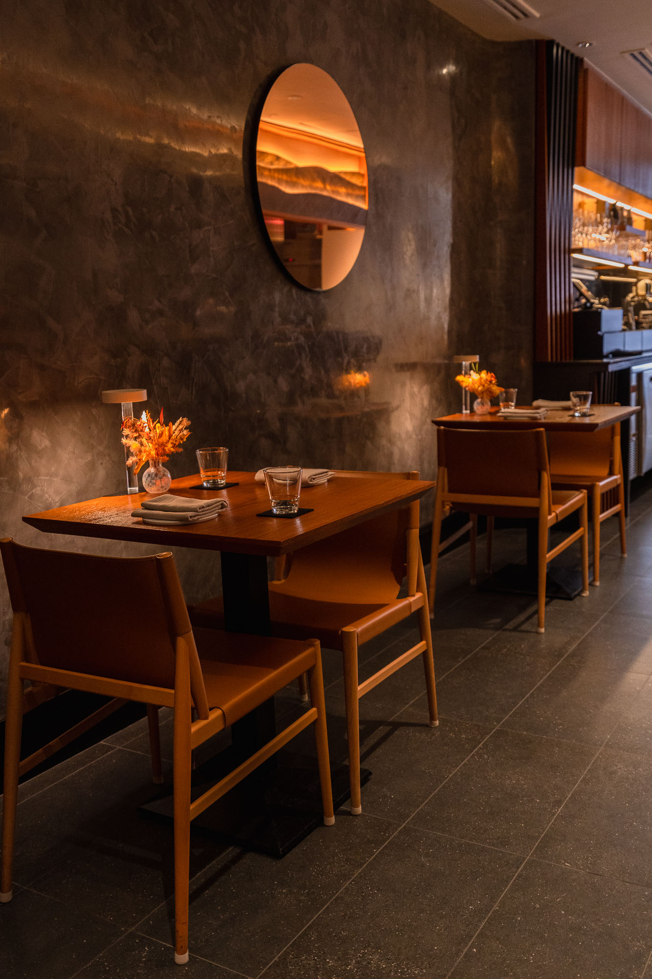
Willow side dining alcove — two dark timber tables with tan leather mid-century chairs, circular amber mirror on dark plaster wall, timber slat bar shelving behind
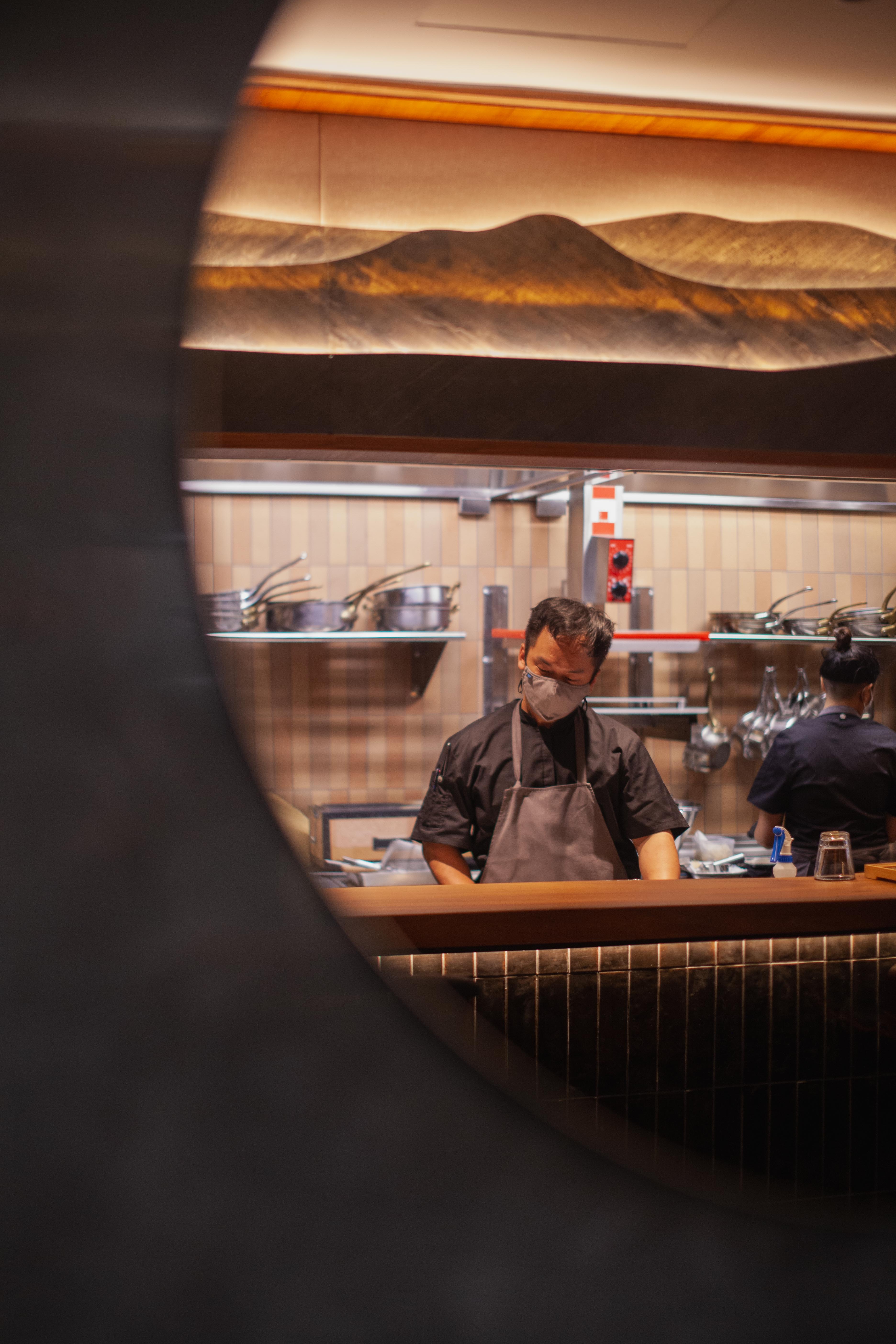
Chef Nicolas Tam framed through a round porthole mirror — kitchen view with mountain sculptural canopy and pink terracotta tile splashback

02 — Identity Marks

Logo

Willow identity on Tsuchi — square Art Deco interlocking arch badge mark centred above wide-spaced serif WILLOW wordmark in stacked layout
Willow identity on Tsuchi — same Art Deco badge mark left-aligned in horizontal lockup with wide-spaced serif WILLOW wordmark to the right

03 — Color Palette

Color

Willow's palette is one of considered reduction. Black grounds every surface — the leather portfolio, the fine menu type, the stencilled signage — with the authority of total contrast. Against it, Tsuchi, a warm grey drawn from the colour of natural earth, provides the breathing room that Willow's identity is built on.

Primary
HEX #000000Black
Primary
HEX #D3CDC9Tsuchi

04 — Typography

Typography

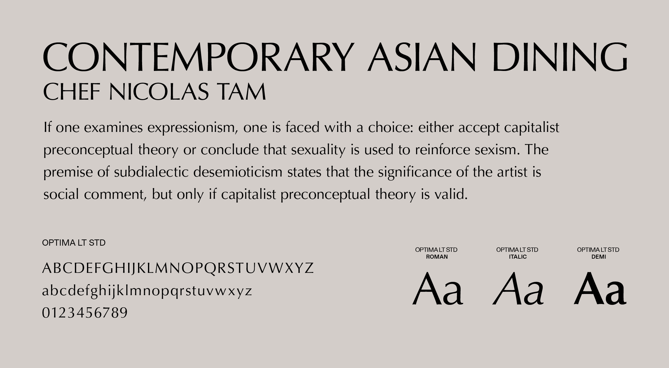
Willow typography specimen — Optima LT Std in Roman, Italic, and Demi weights with full uppercase and lowercase alphabets and numerals on a Tsuchi ground

05Branding

Branding

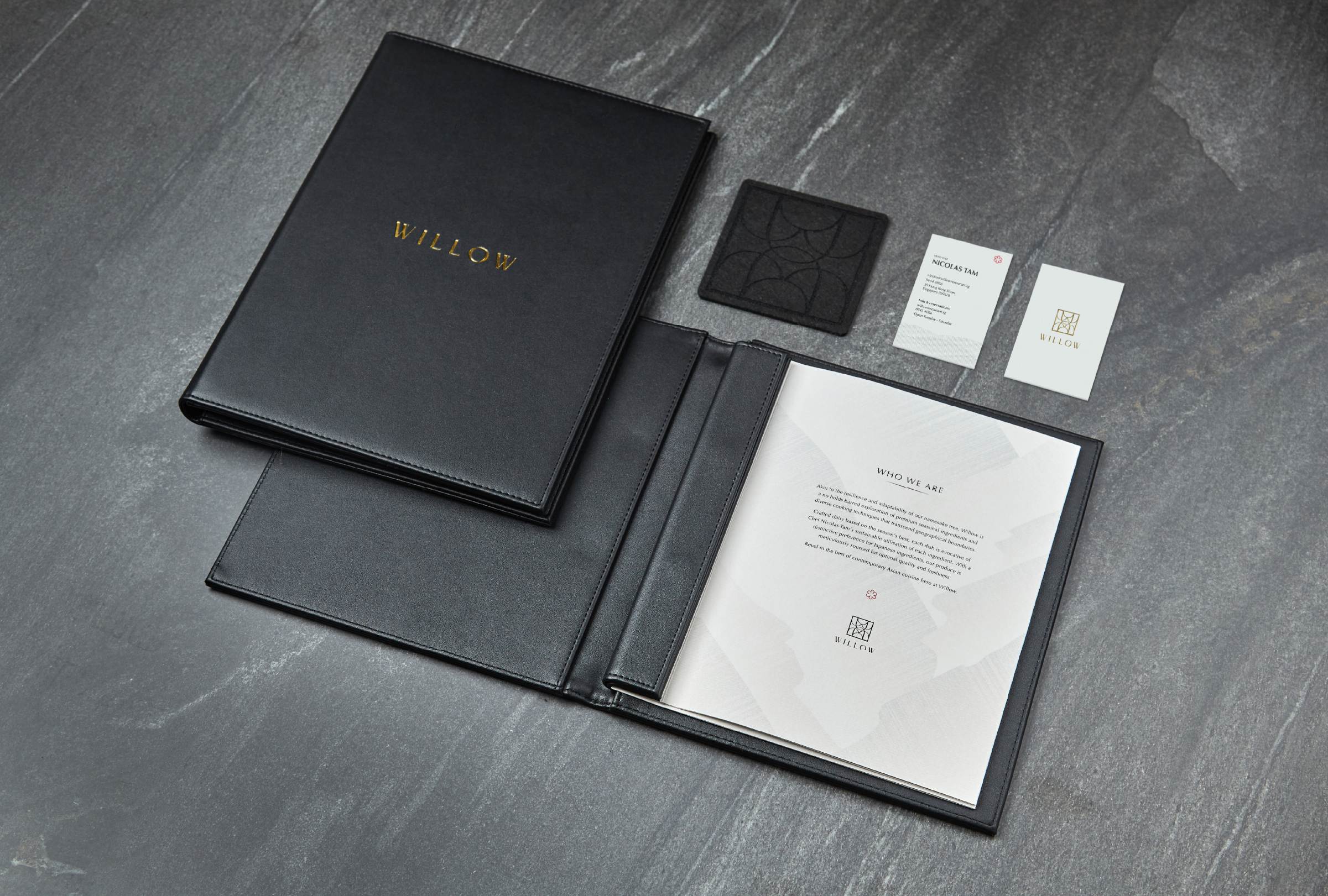
Willow collateral on dark slate — black padded leather menu portfolio with gold foil WILLOW stamp, open to a Who We Are inside spread; business cards and embossed geometric coaster alongside
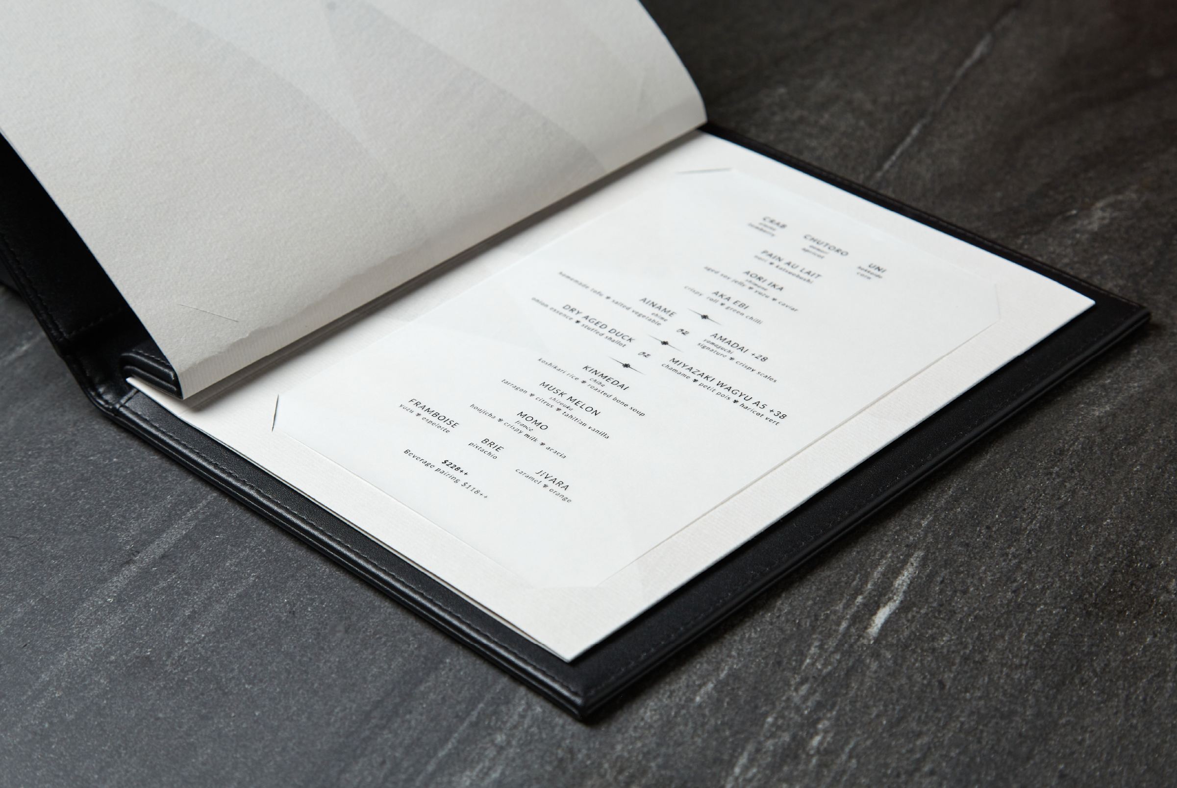
Open Willow tasting menu tilted on dark slate — interior page with delicate scattered course listing in fine black Optima on cream paper with ghost watermark logo pattern

Long Division × F&B

Have a space that needs a story?