Brand Identity & Spatial Design
Love Handle
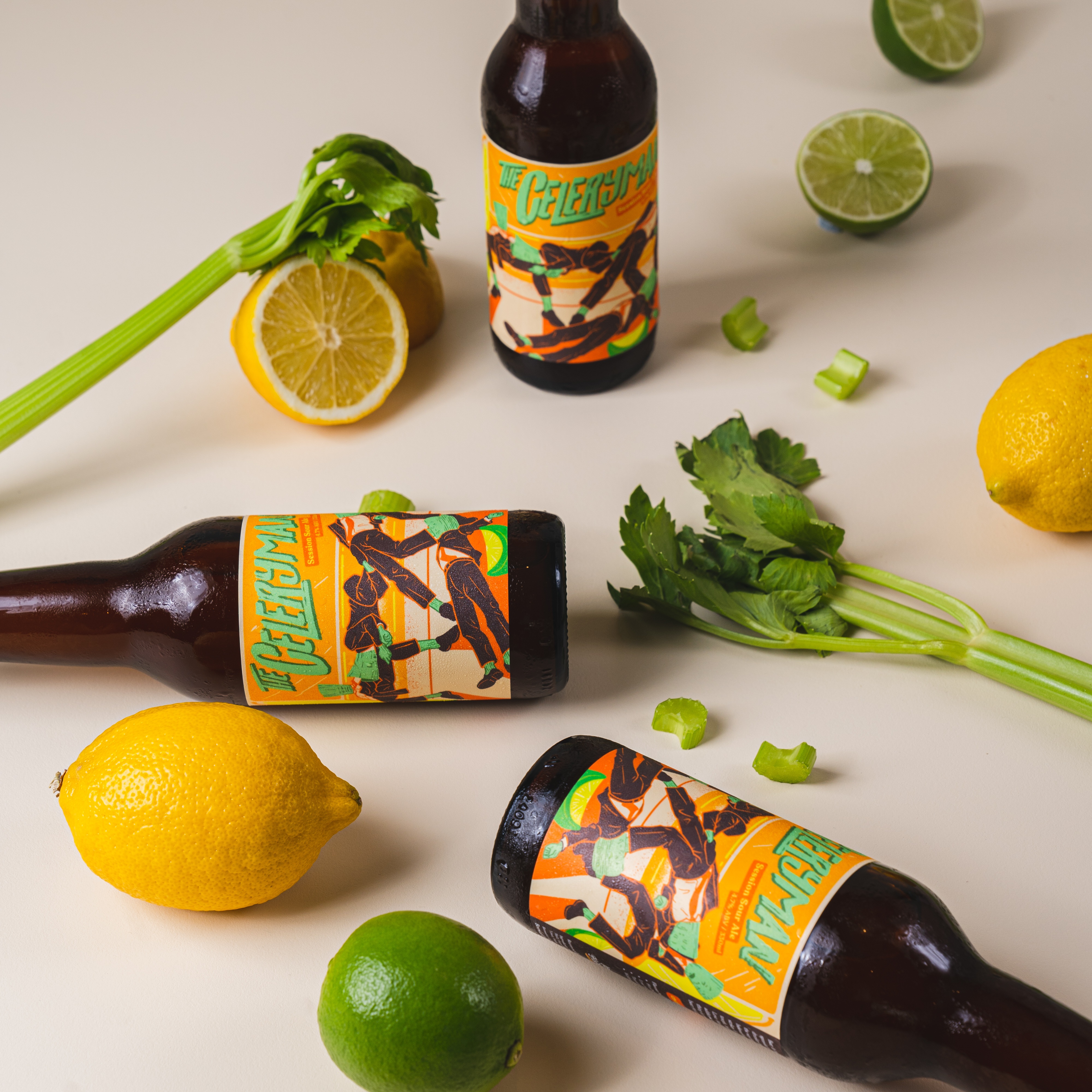
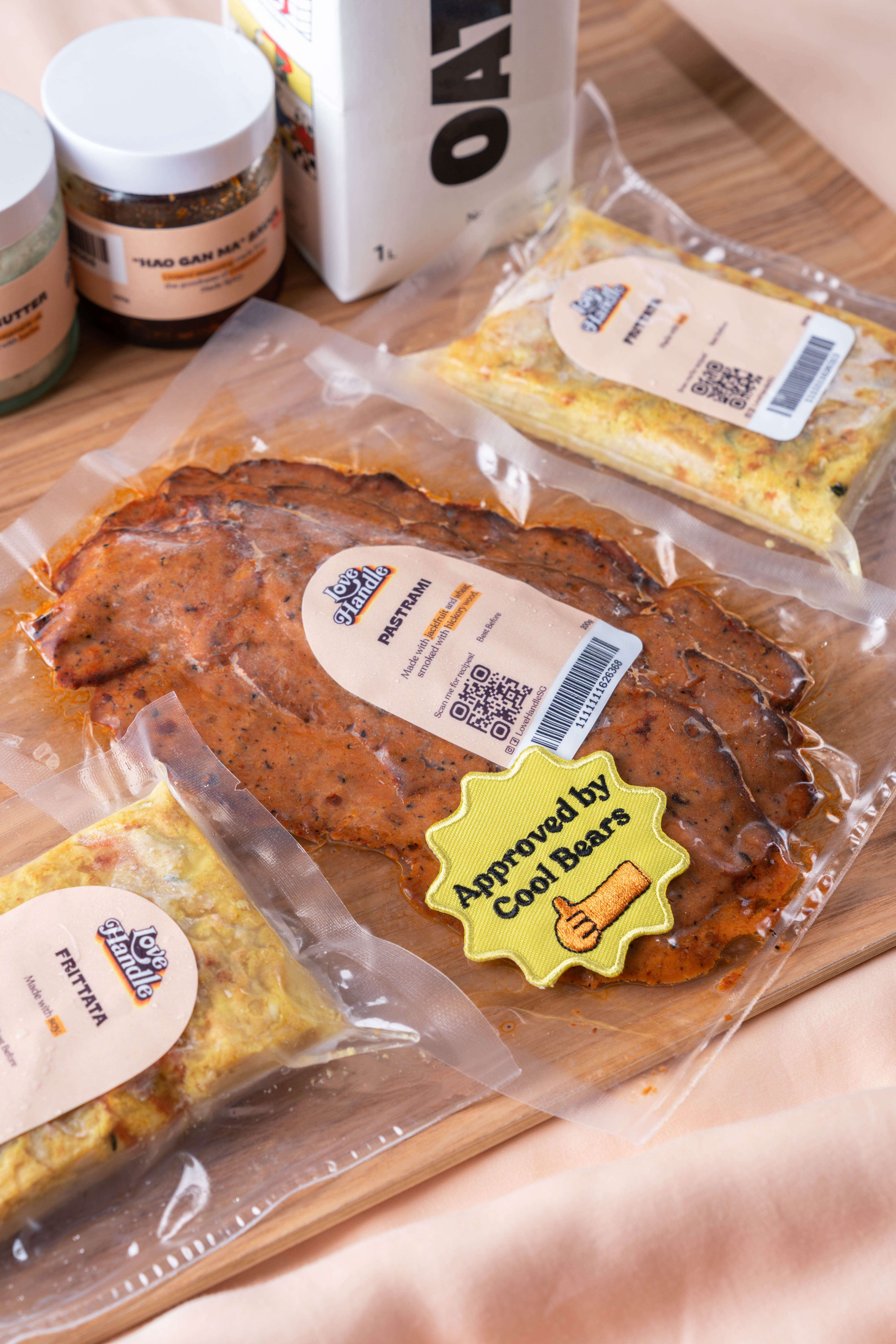
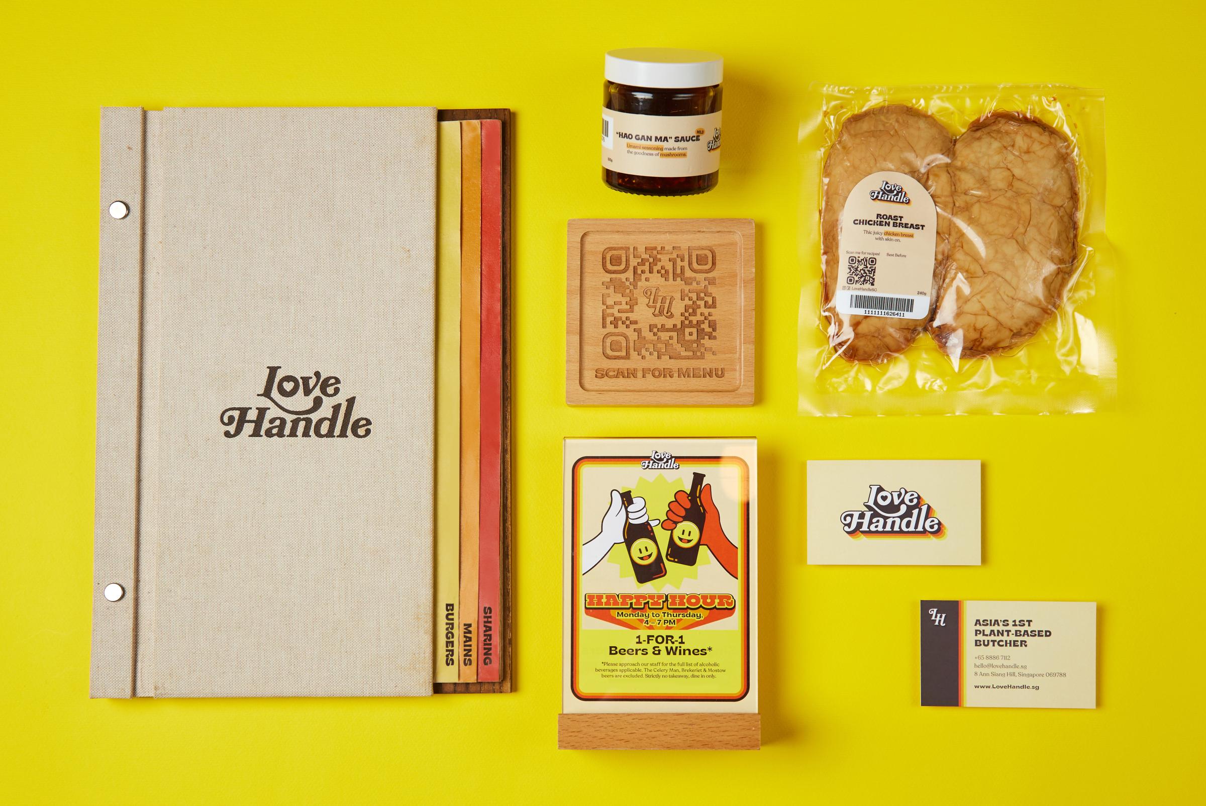
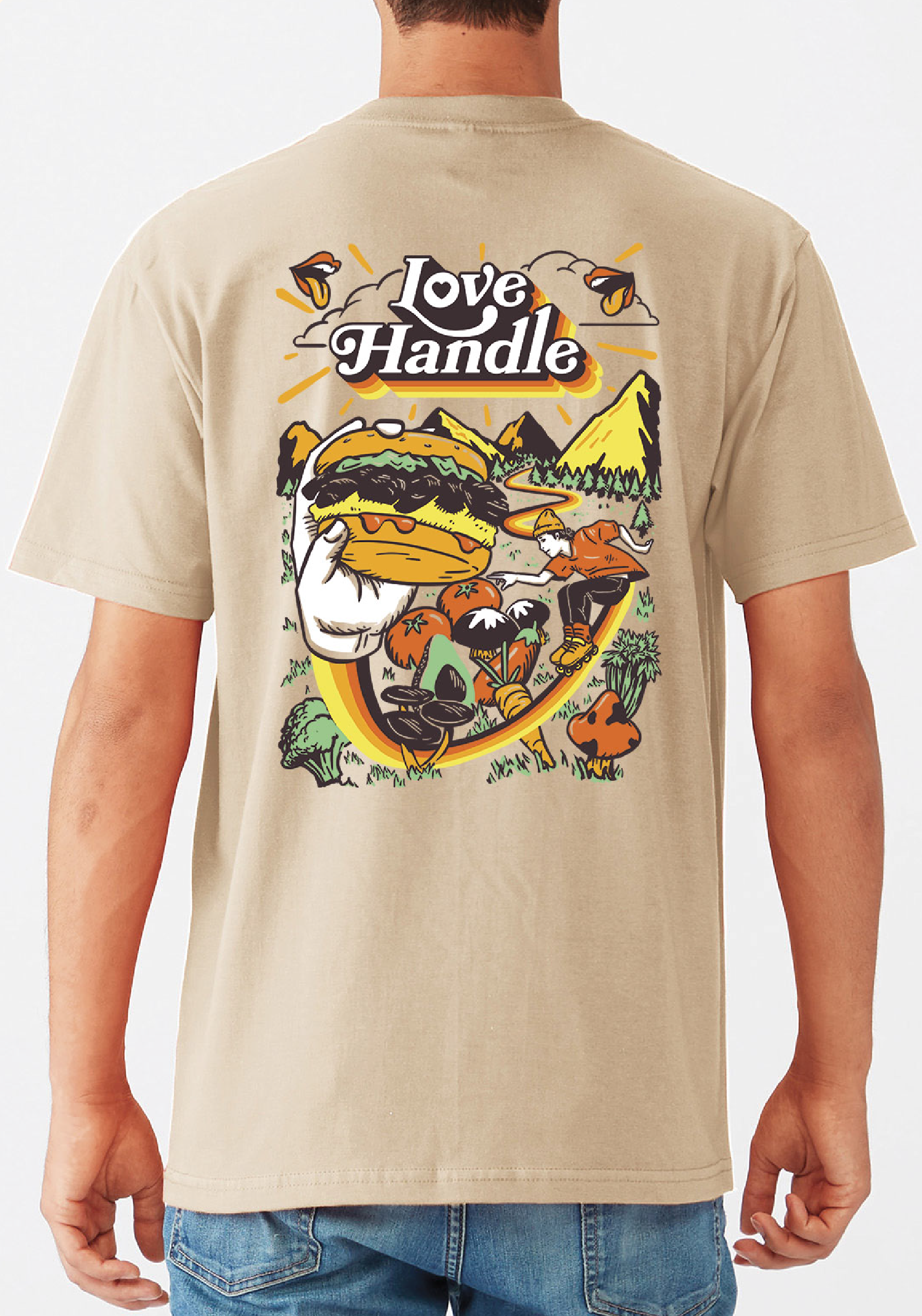
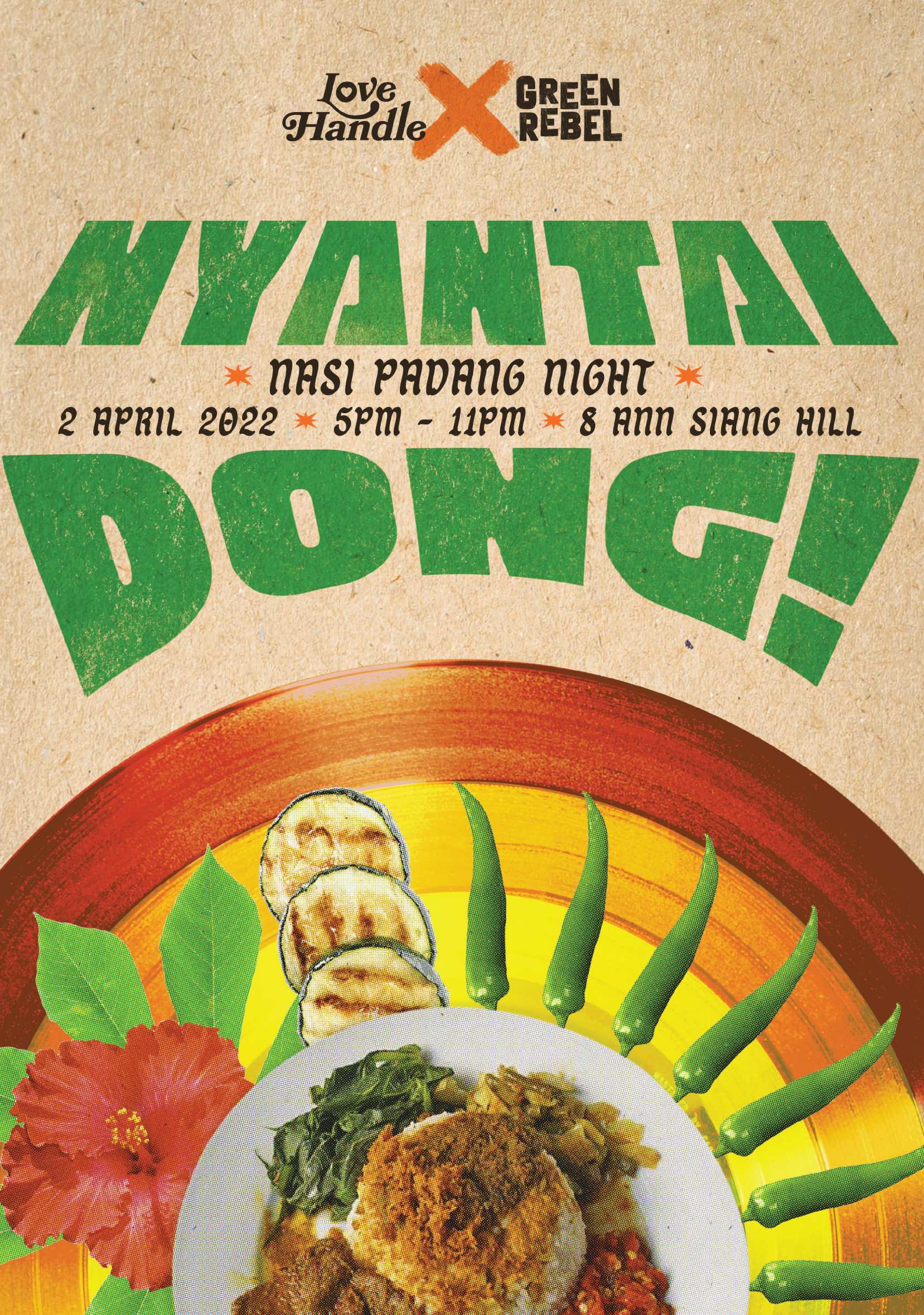
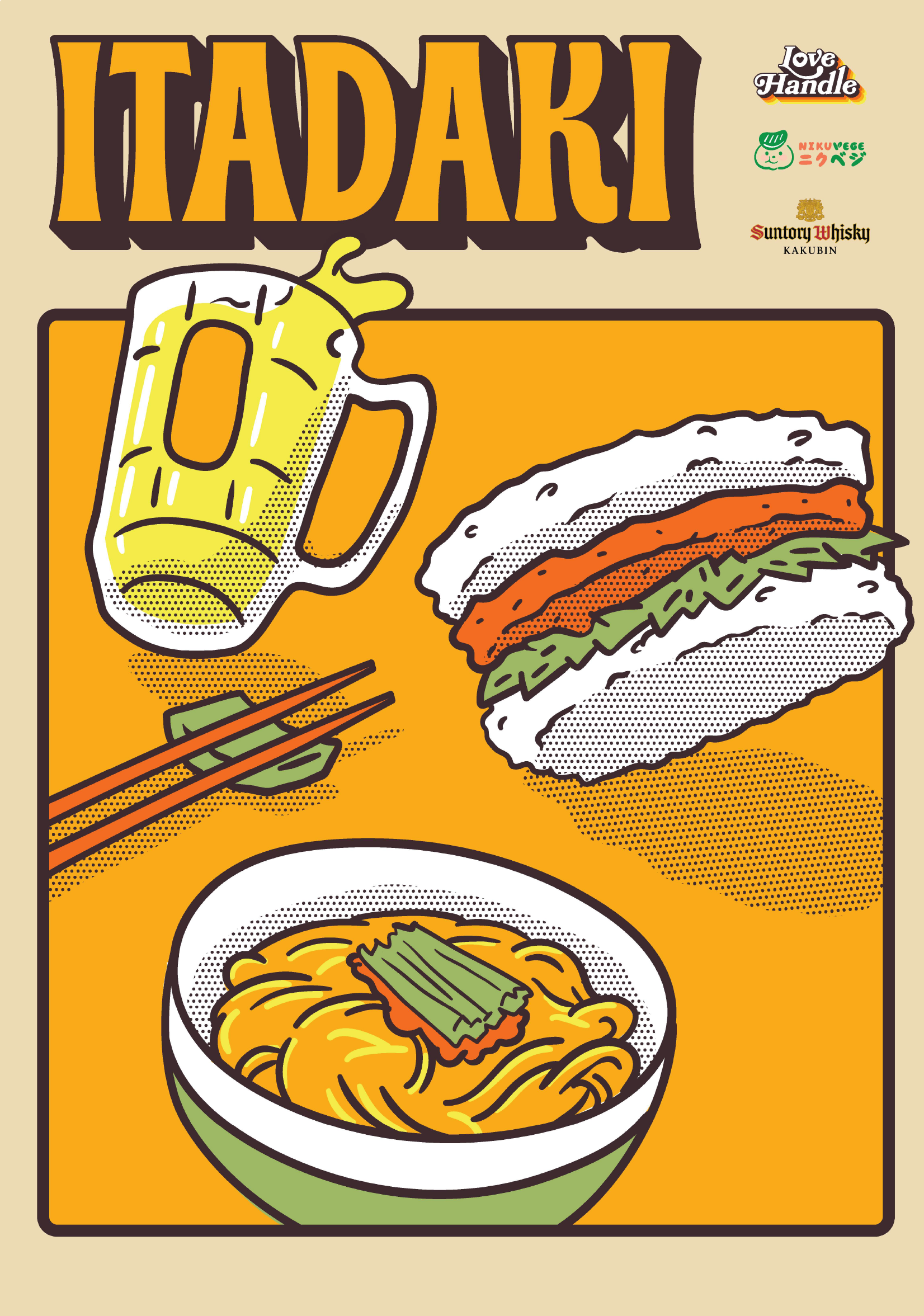
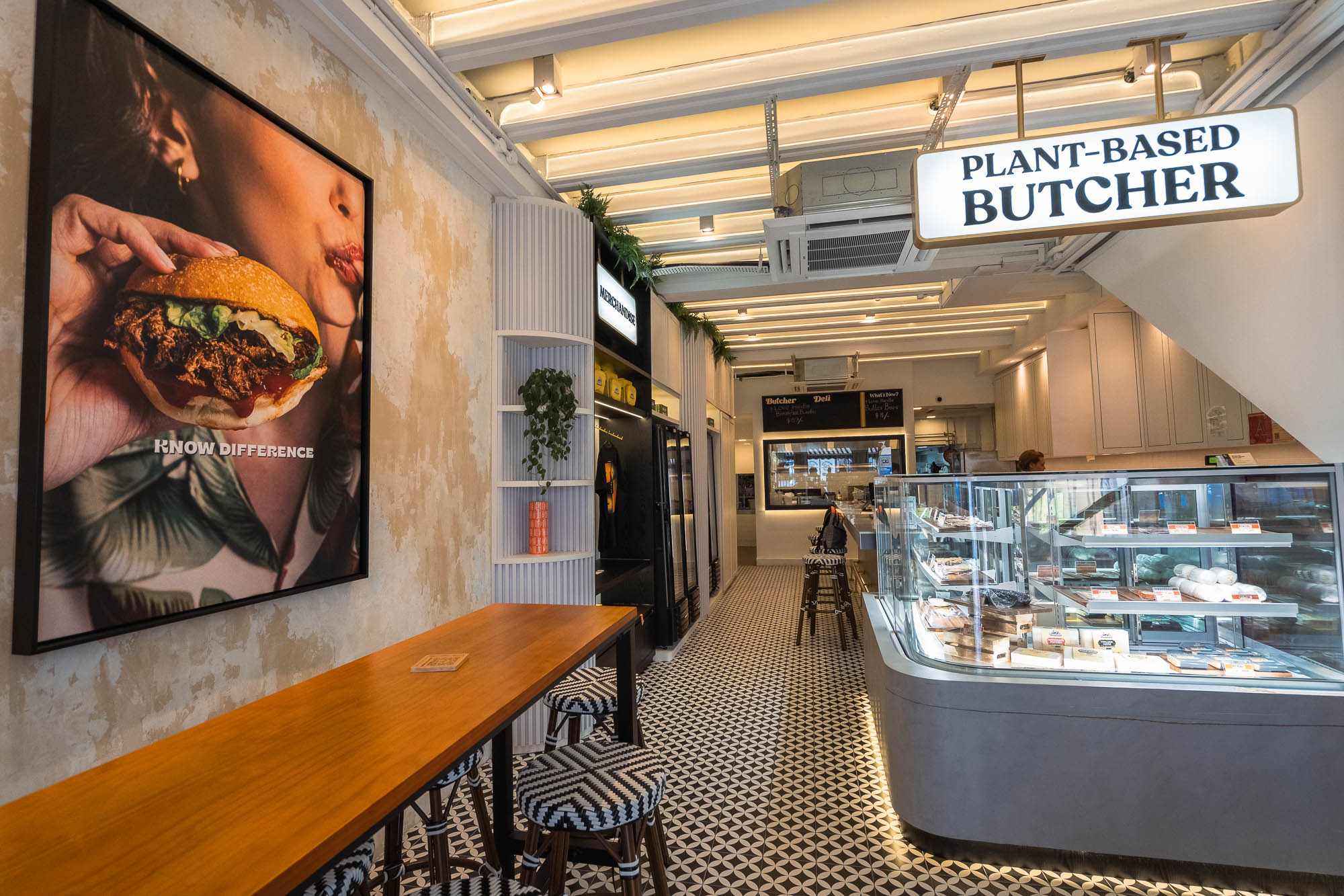
Love Handle reimagines burger culture through a plant-based lens, creating a brand that welcomes everyone to the table. Drawing from the bold optimism of 1950s American diners and California surf culture, the identity pairs nostalgic graphics with a playful spirit.
- Creative Direction
- Norman Hartono
- Graphic Designers
- Faiye del Rosario, Dillon Tan
- Drafting & Build
- FIDE ID Pte. Ltd.
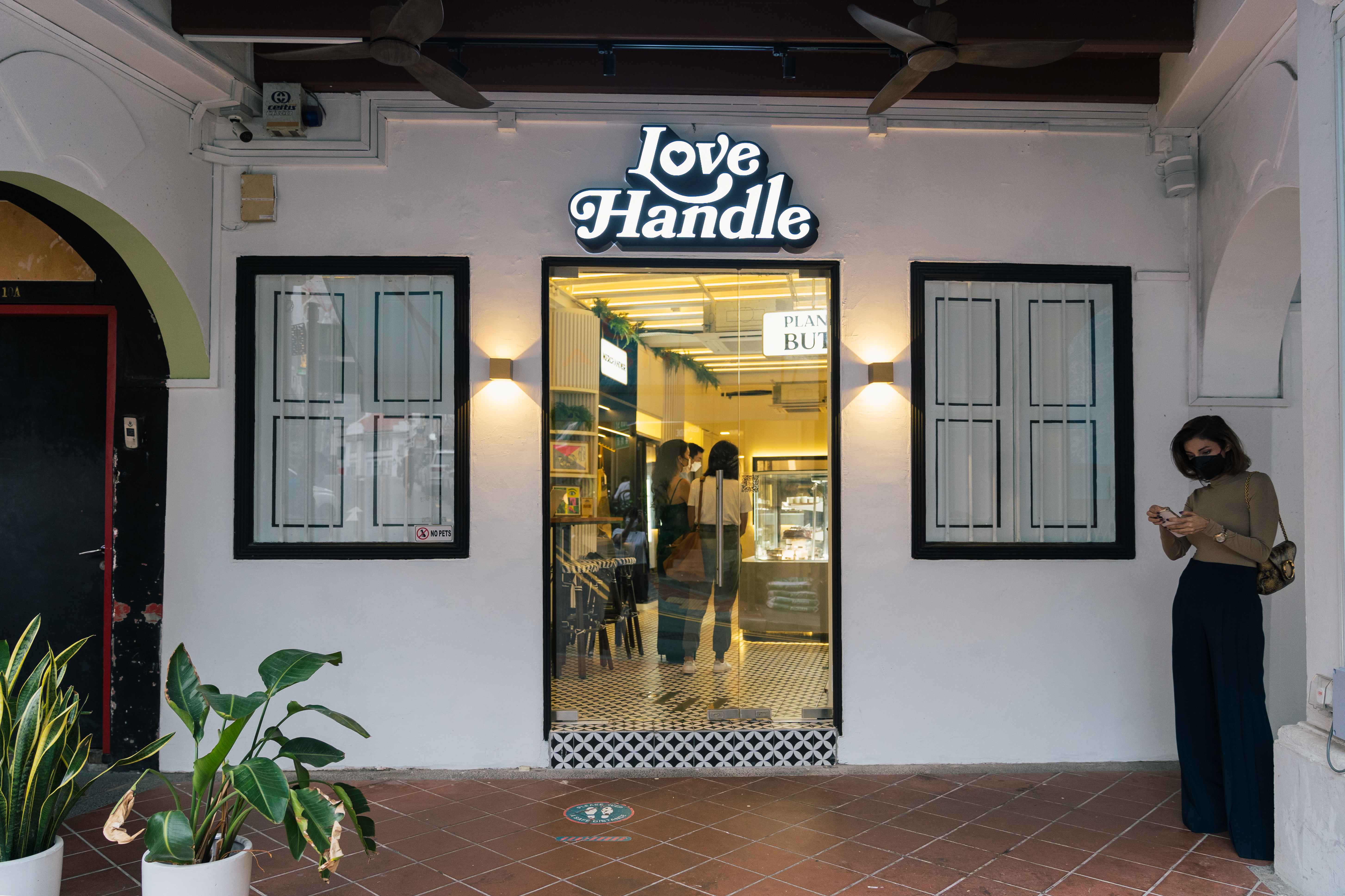
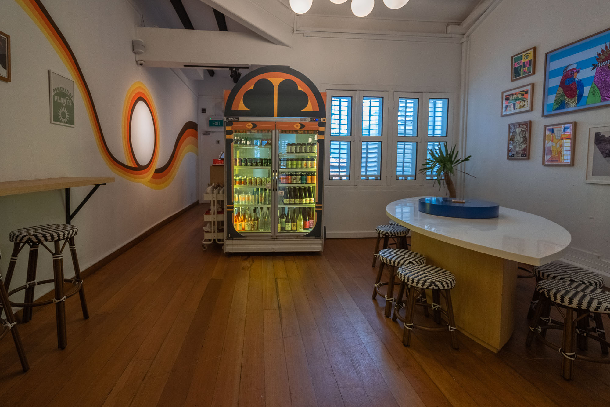
01 — Interiors / Spatial Design
Spatial Design
02 — Identity Marks
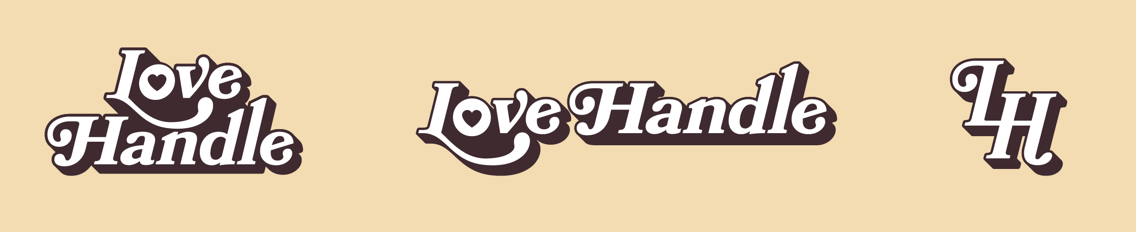
Logo
03 — Color Palette
Color
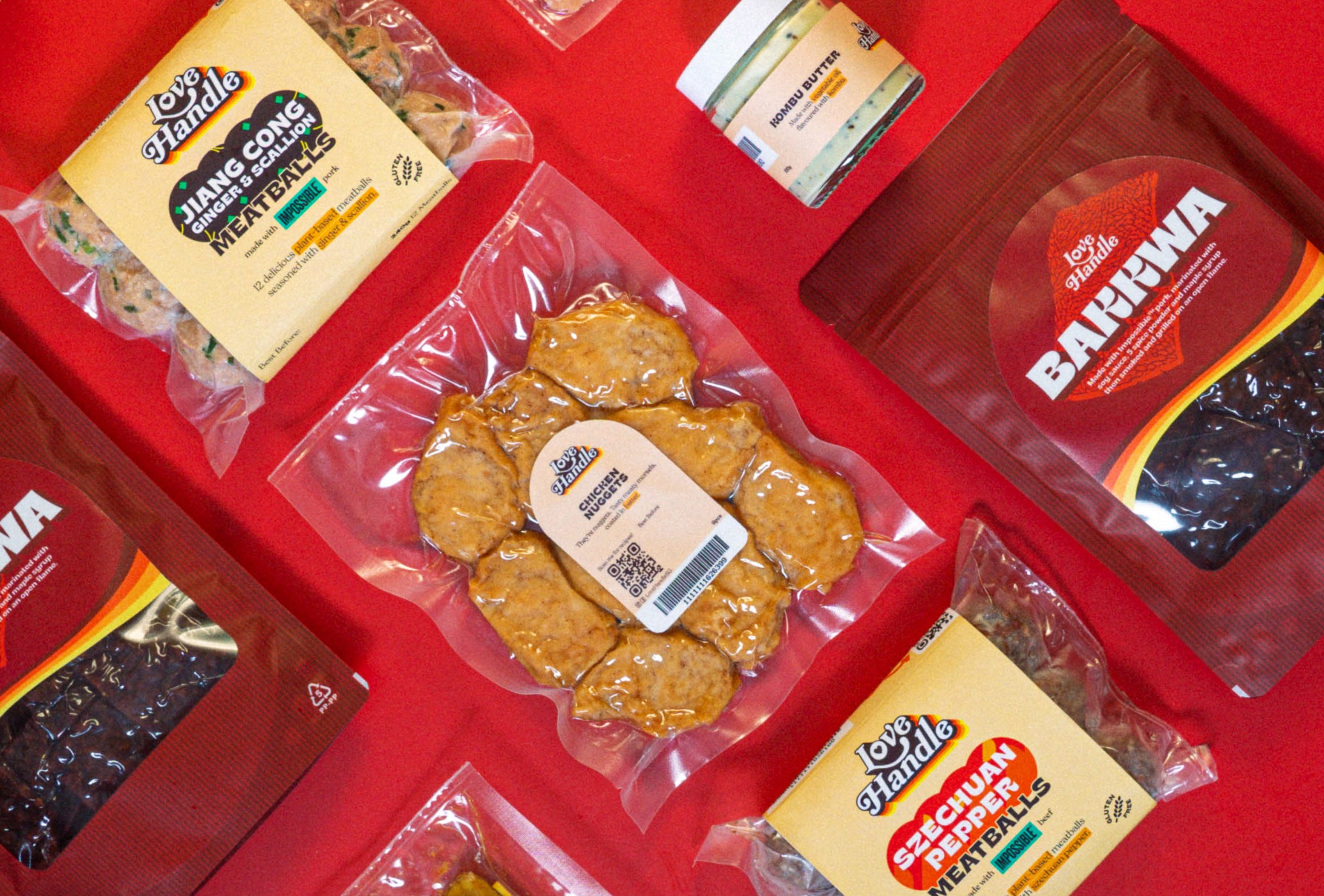
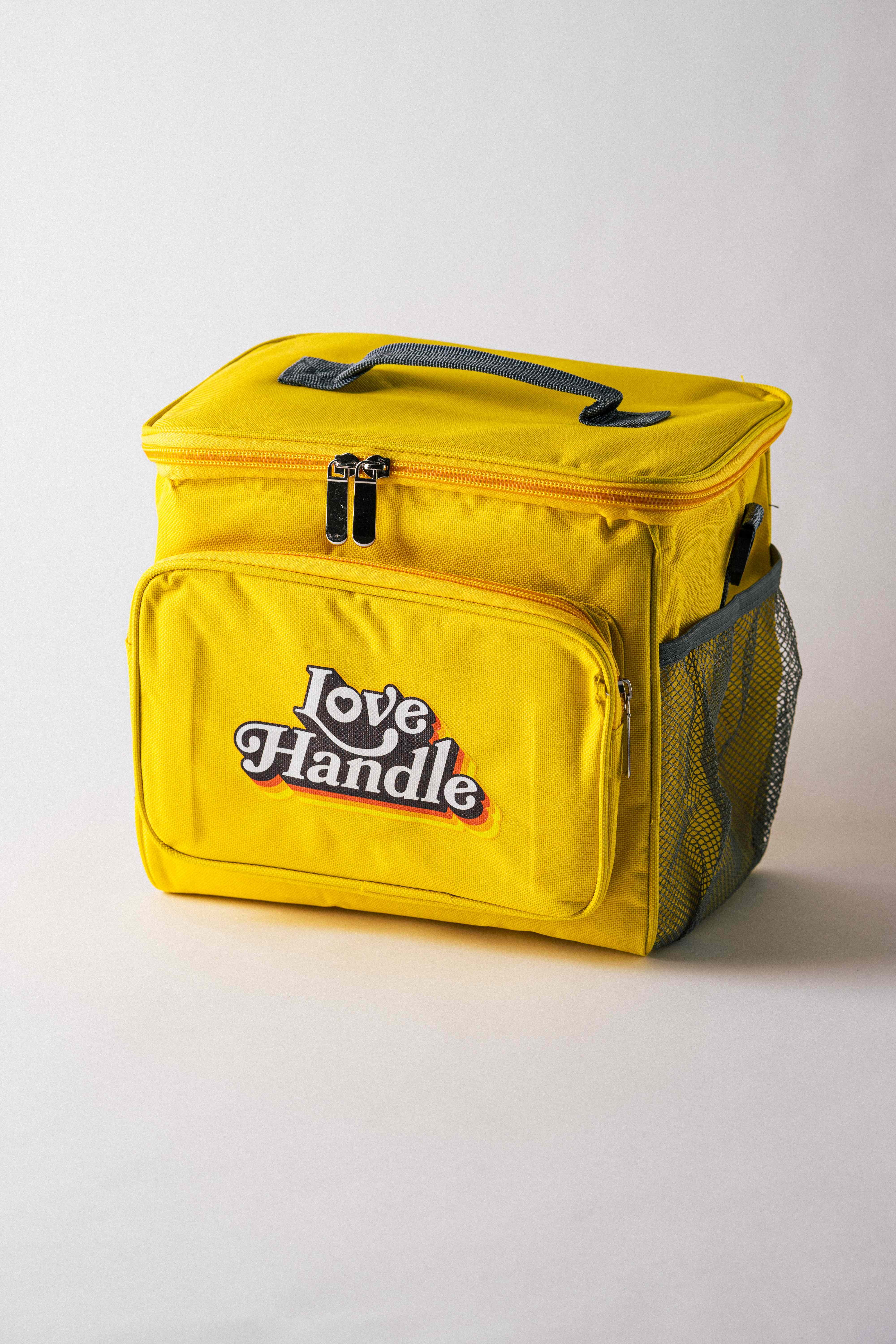
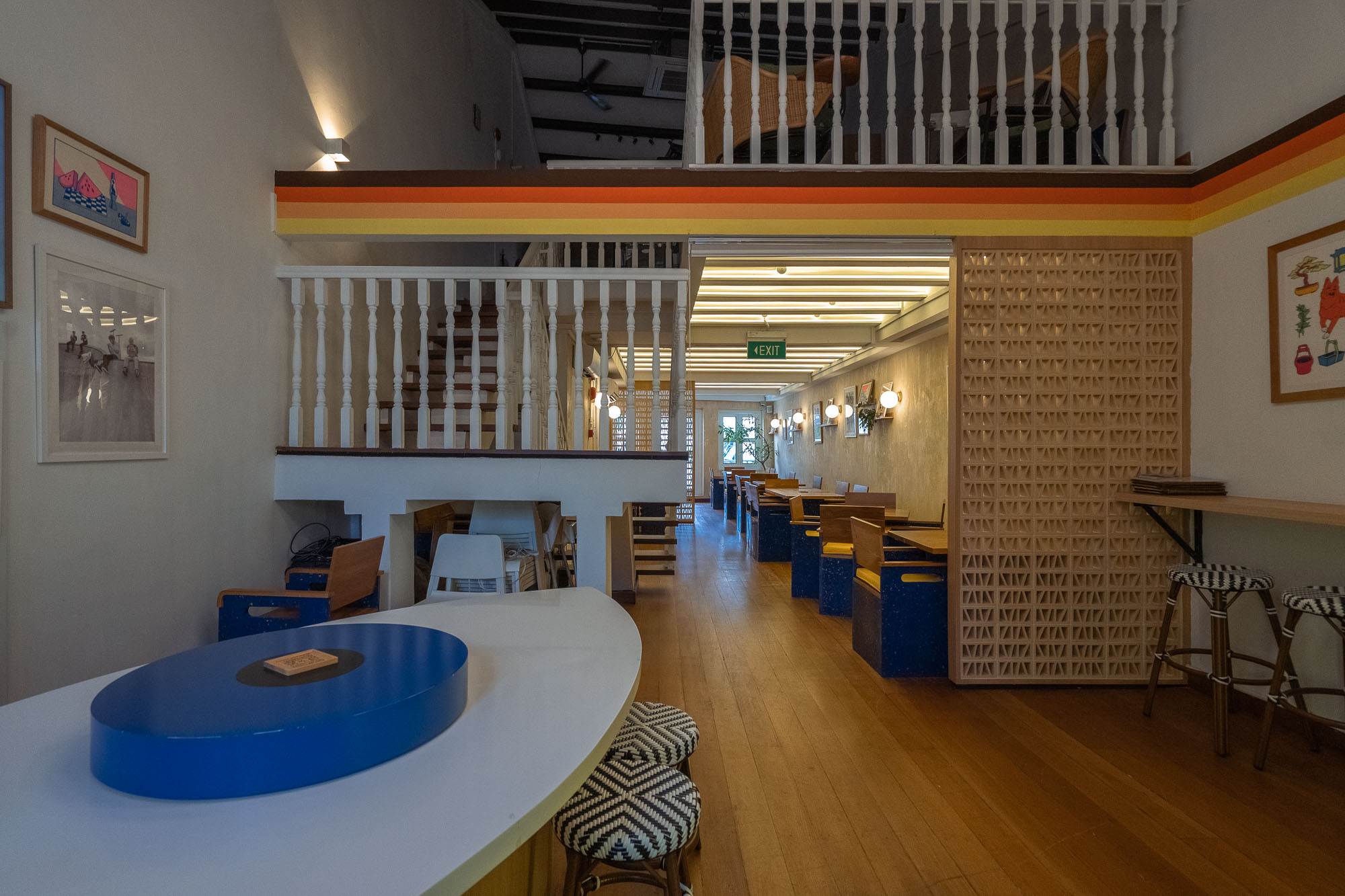
Love Handle's palette is pure diner optimism. Cocoa grounds the identity like a well-worn menu board, while Carrot, Pumpkin, and Lemon stack into the sun-faded rainbow that runs across the walls, packaging, and signage. Oatmeal ties it together as the warm, nostalgic paper stock the whole brand is printed on.
Primary
HEX #3E2B2ECocoa
Primary
HEX #FF6A13Carrot
Primary
HEX #FFAD00Pumpkin
Primary
HEX #F7EA48Lemon
Secondary
HEX #EFDBB2Oatmeal
04 — Typography
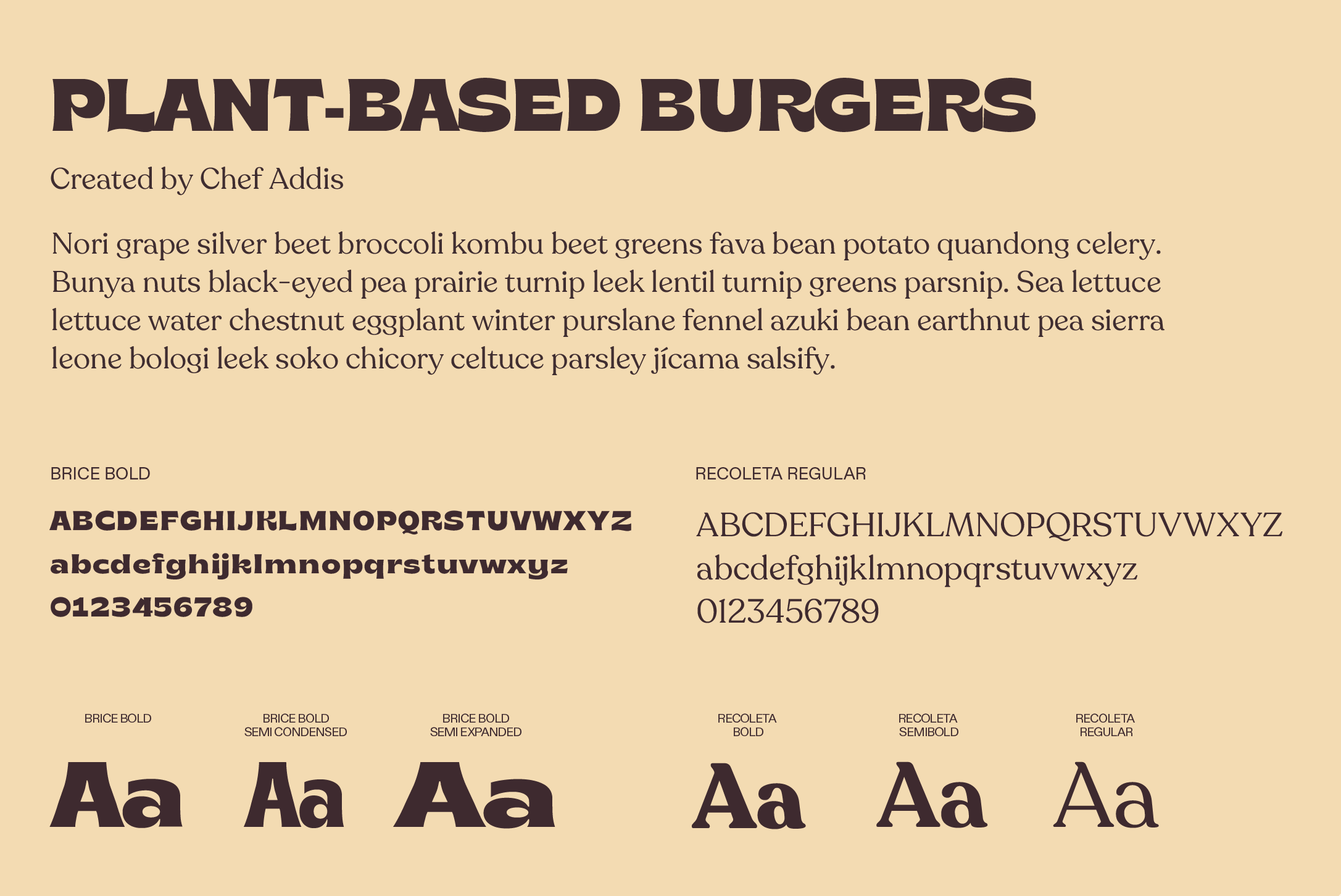
Typography
05 — Branding
Branding