← BACK TO WORK

Brand Identity System

Kairos Caviar

Kairos Caviar draws from the Greek god of the opportune moment, framing luxury as something to be savoured rather than reserved. Rooted in classical elegance yet lifted by bold, playful colour, the identity tempers tradition with a sense of ease.

The result is a brand that feels timeless, approachable, and made for moments worth remembering.

Creative Direction
Norman Hartono
Graphic Designer
Faiye del Rosario
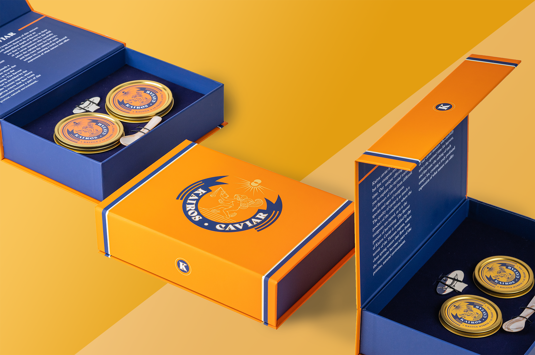
Kairos Caviar packaging suite — orange and navy magnetic gift boxes opened to reveal gold caviar tins and mother-of-pearl spoons, on a yellow backdrop

01Branding

Branding

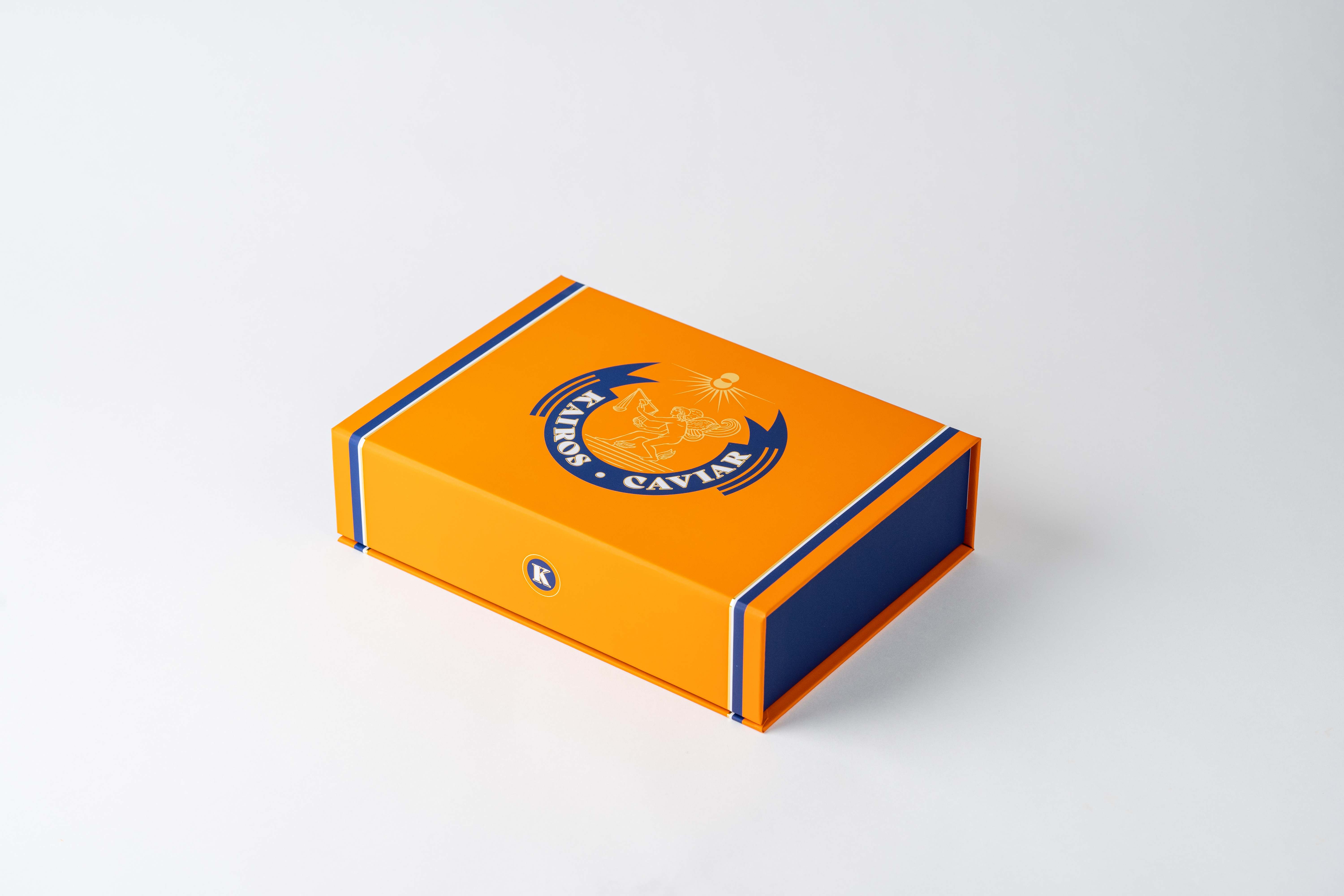
Kairos Caviar magnetic gift box in bright orange with a navy stripe and the winged Kairos crest, closed on a white backdrop
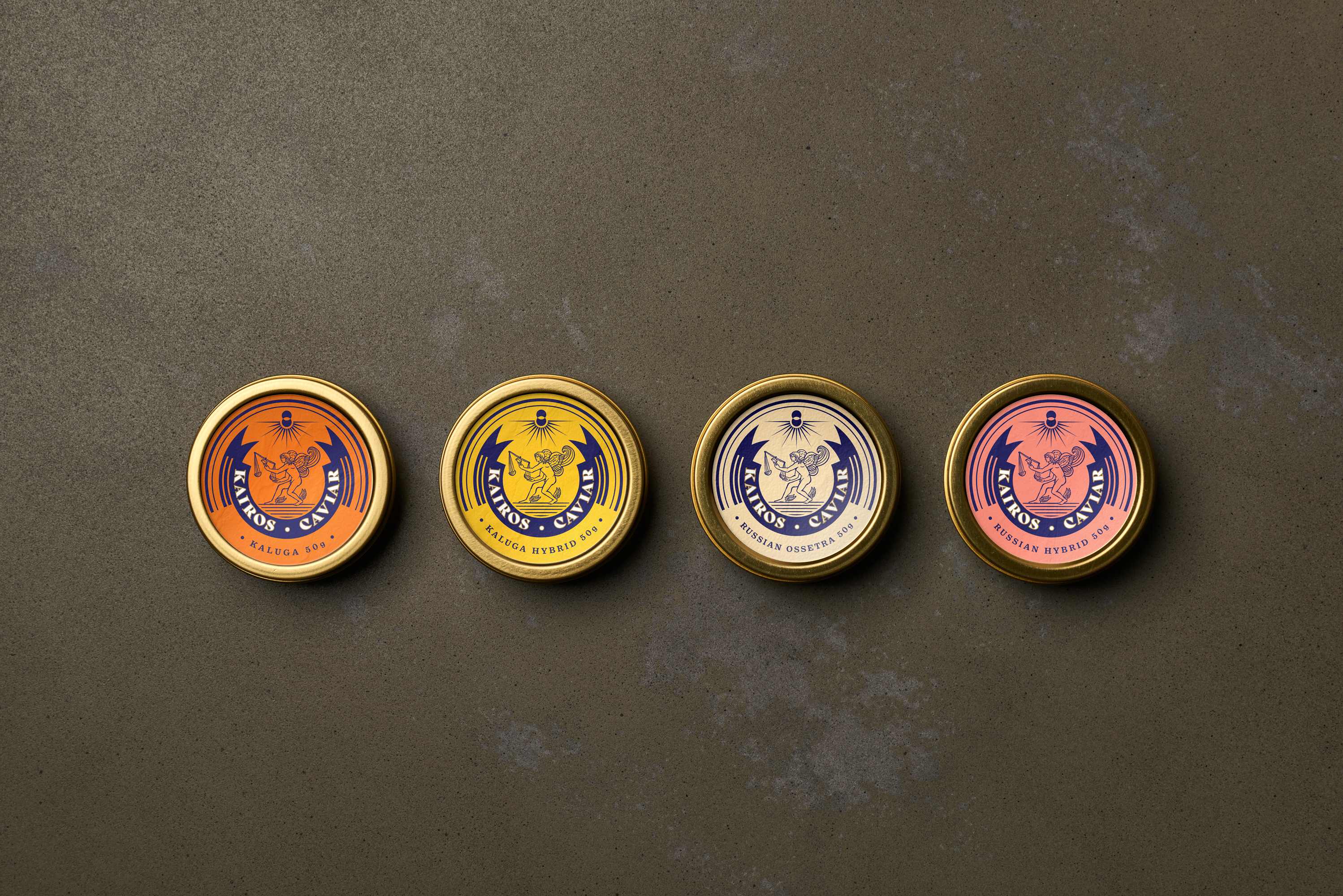
Four gold Kairos Caviar tins in a row — orange Kaluga, yellow Kaluga Hybrid, cream Russian Ossetra, and pink Russian Hybrid labels on a grey concrete surface
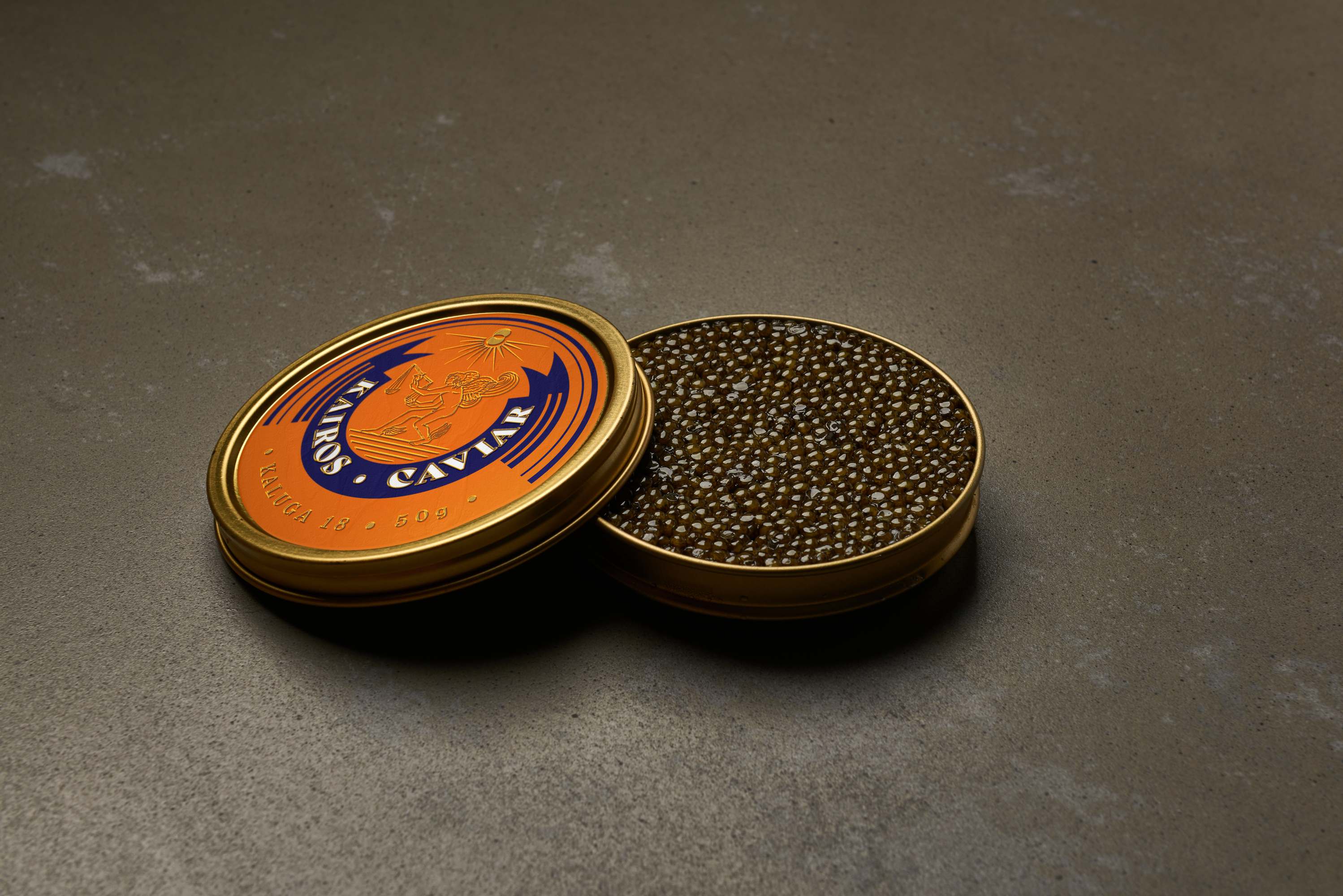
An open orange Kairos Caviar tin with its lid resting beside it, revealing glossy dark Kaluga caviar
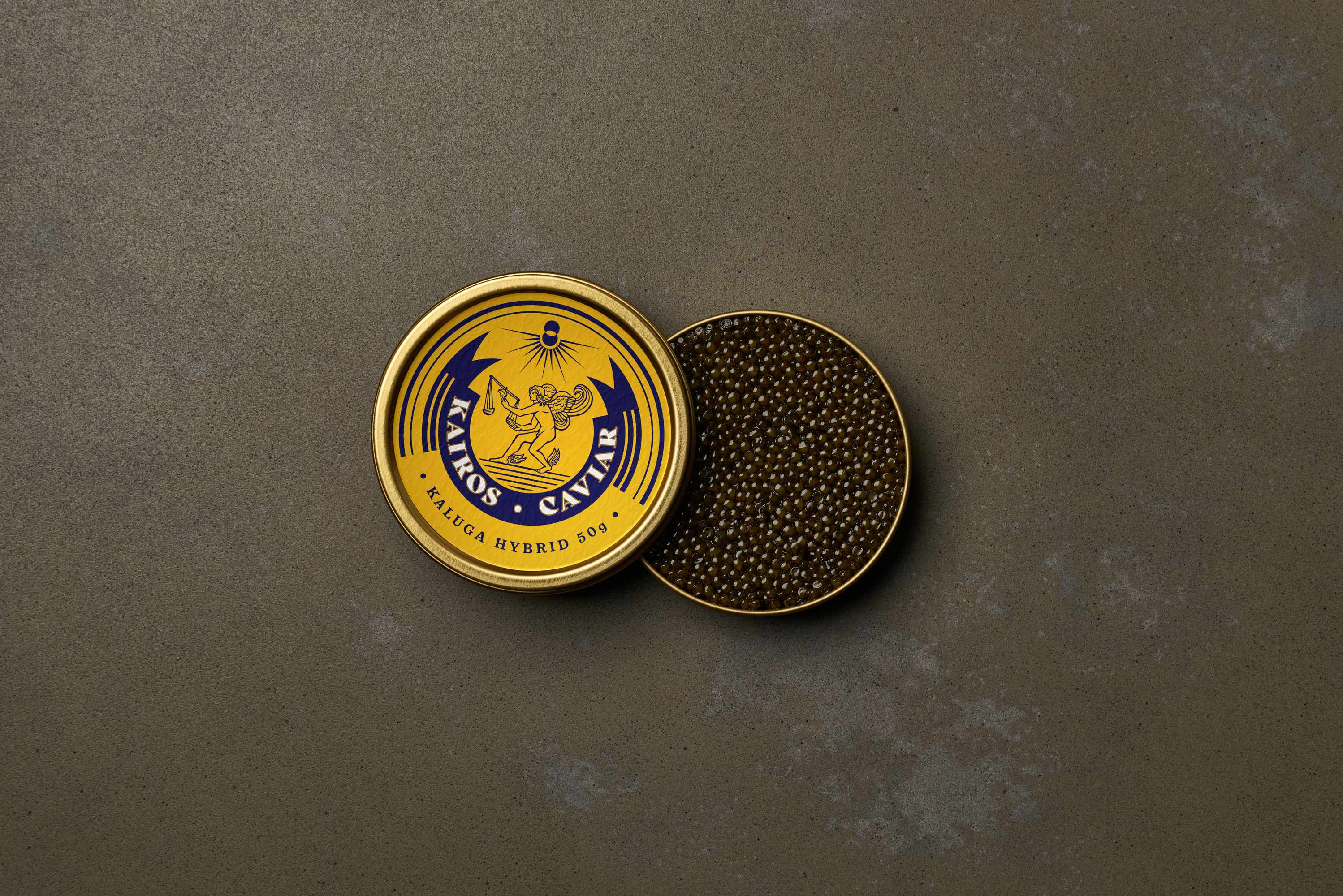
An open yellow Kaluga Hybrid Kairos Caviar tin beside its lid full of caviar on a grey concrete surface

02 — Identity Marks

Identity Marks

Kairos Caviar primary wordmark — KAIROS · CAVIAR set in a classical navy serif
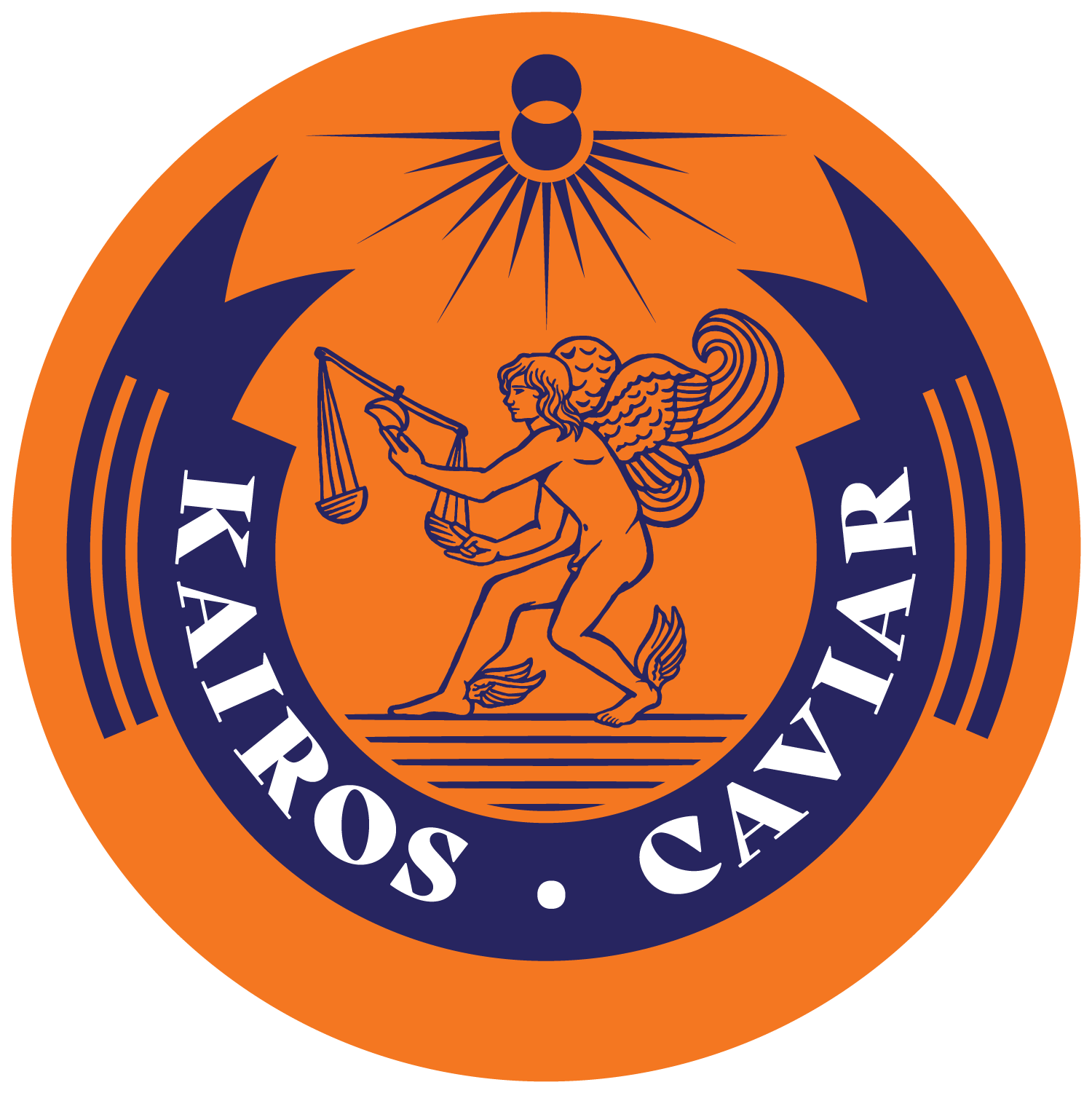
Kairos Caviar circular crest — a winged figure of Kairos holding scales beneath a sunburst, ringed by KAIROS · CAVIAR in navy on orange

03 — Color Palette

Color

Kairos's palette pairs a deep classical Navy with a vivid Kaluga Orange for its primary voice, then opens into a playful set of secondaries — Hybrid Yellow, Ossetra Cream, and Russian Pink — that colour-code the range while keeping the identity bold and approachable.

Primary
HEX #211F5DNavy
Primary
HEX #ED6F03Kaluga Orange
Secondary
HEX #FEC905Hybrid Yellow
Secondary
HEX #FED992Ossetra Cream
Secondary
HEX #EC6750Russian Pink

04 — Typography

Typography
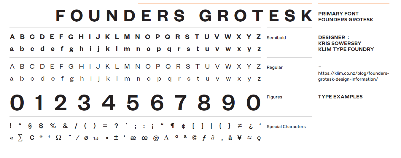
Primary typeface specimen — Founders Grotesk by Kris Sowersby, Klim Type Foundry, shown with full alphabet, numerals, and special characters
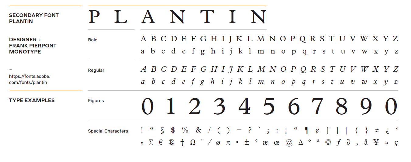
Secondary typeface specimen — Plantin by Frank Pierpont, Monotype, shown with full alphabet, numerals, and special characters

Long Division × F&B

Have a space that needs a story?