Brand Identity System
Chin Mee Chin
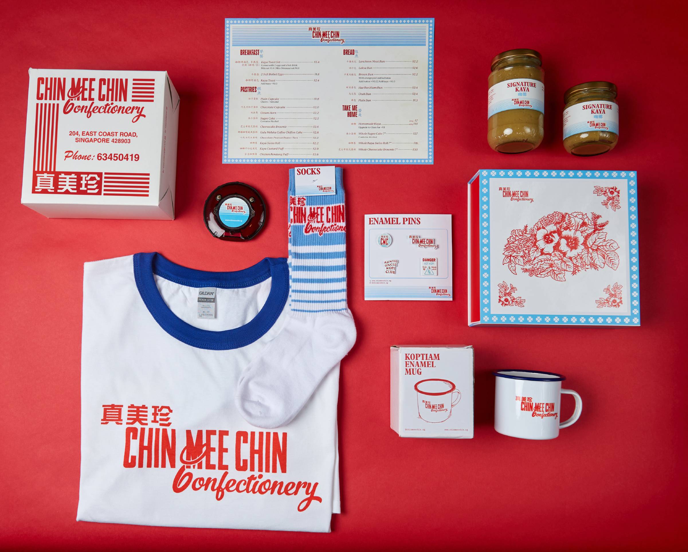
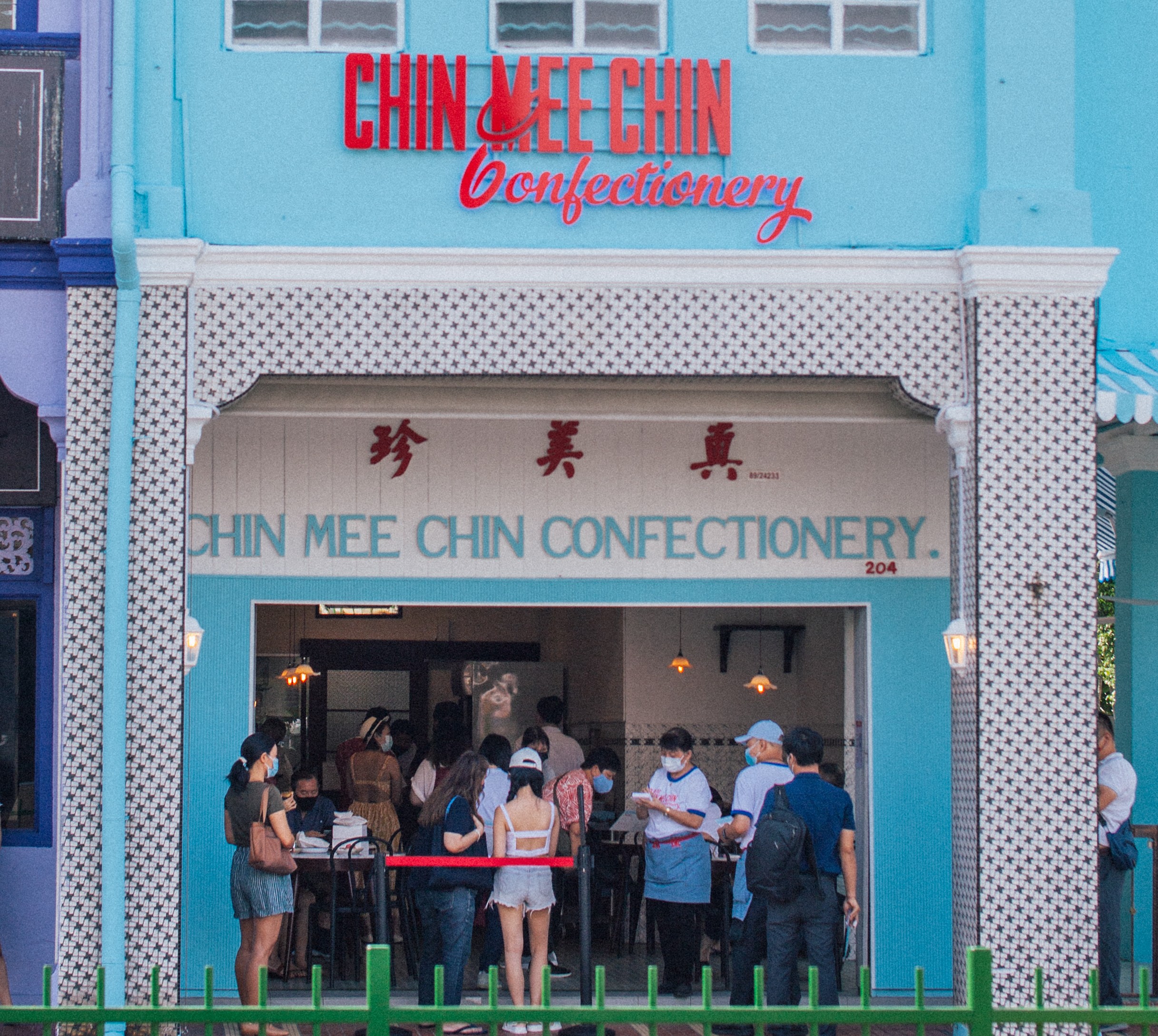
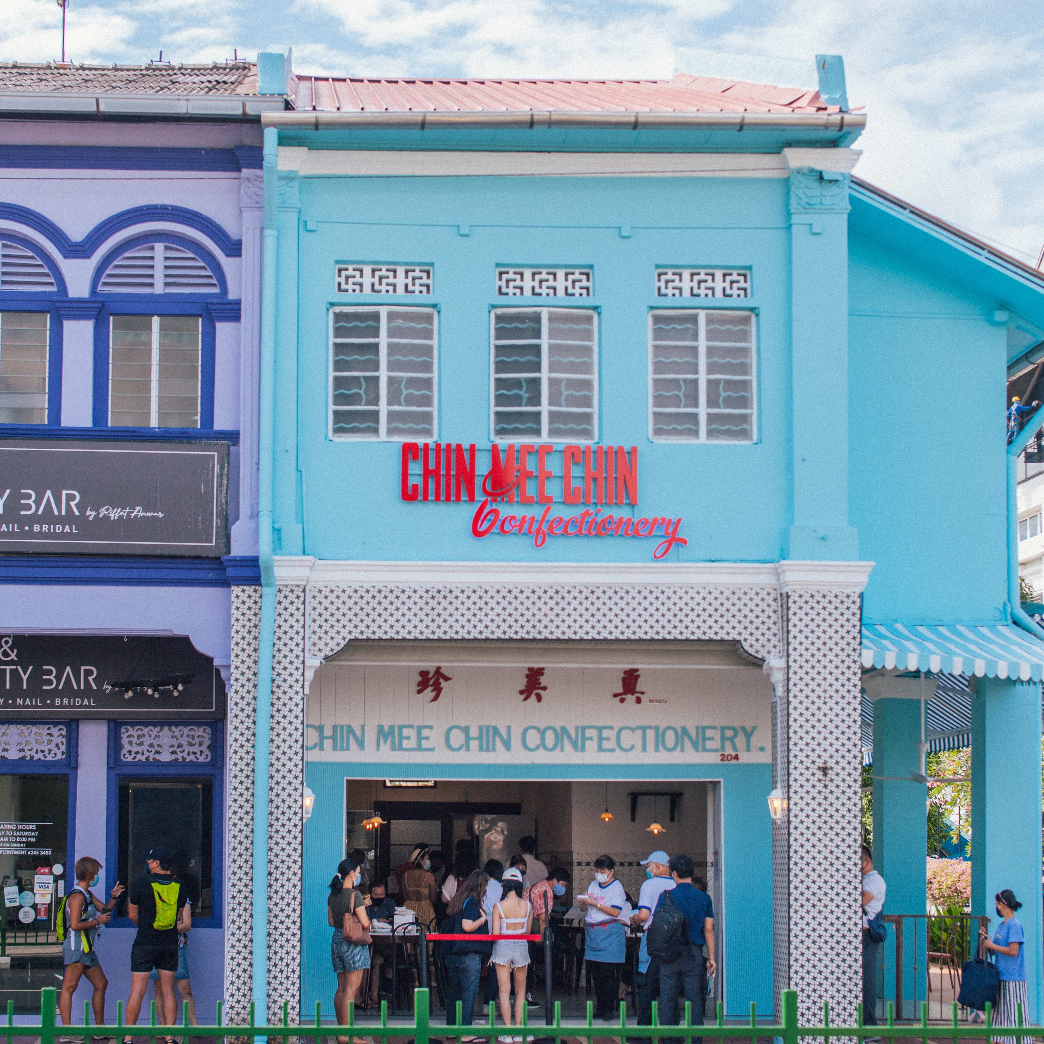
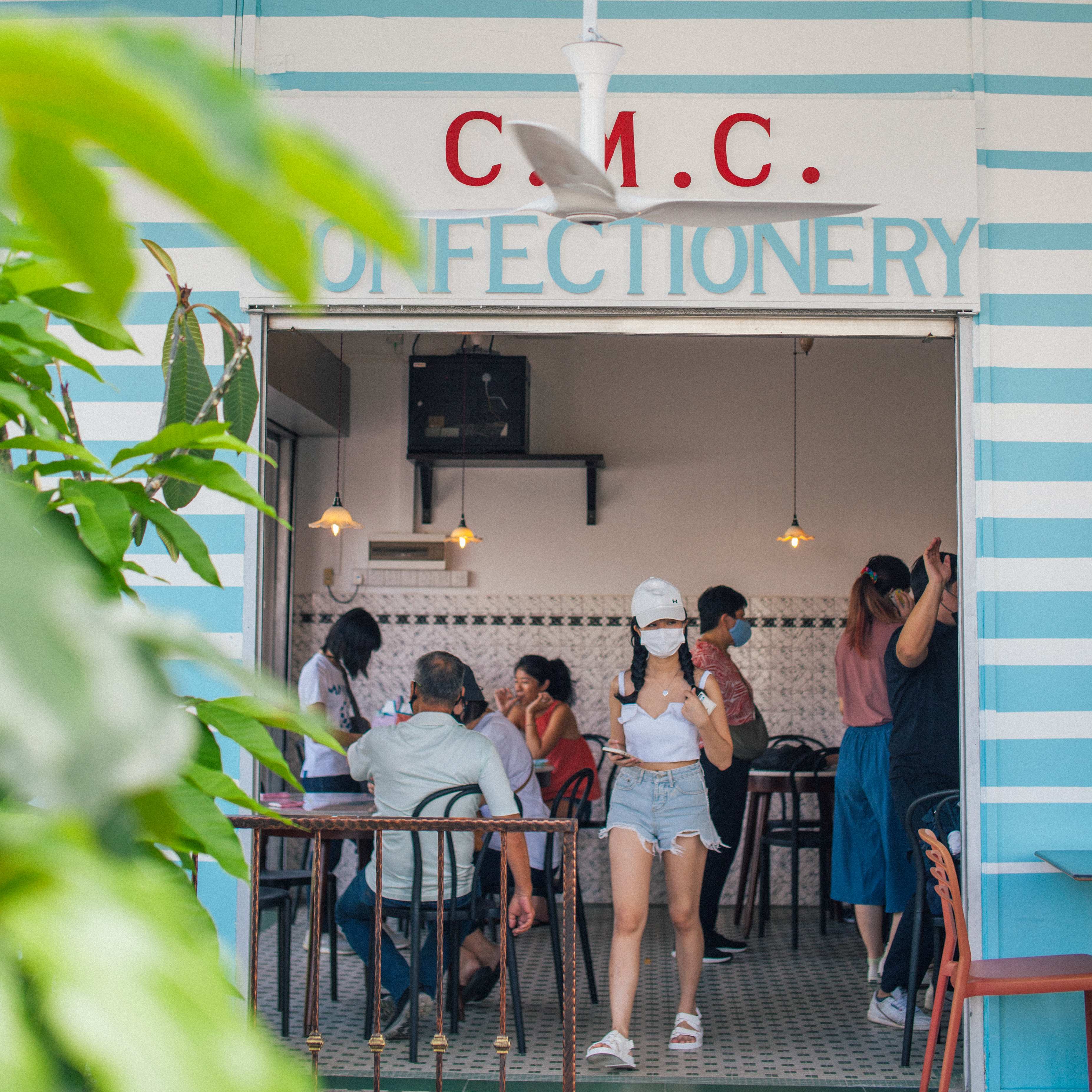
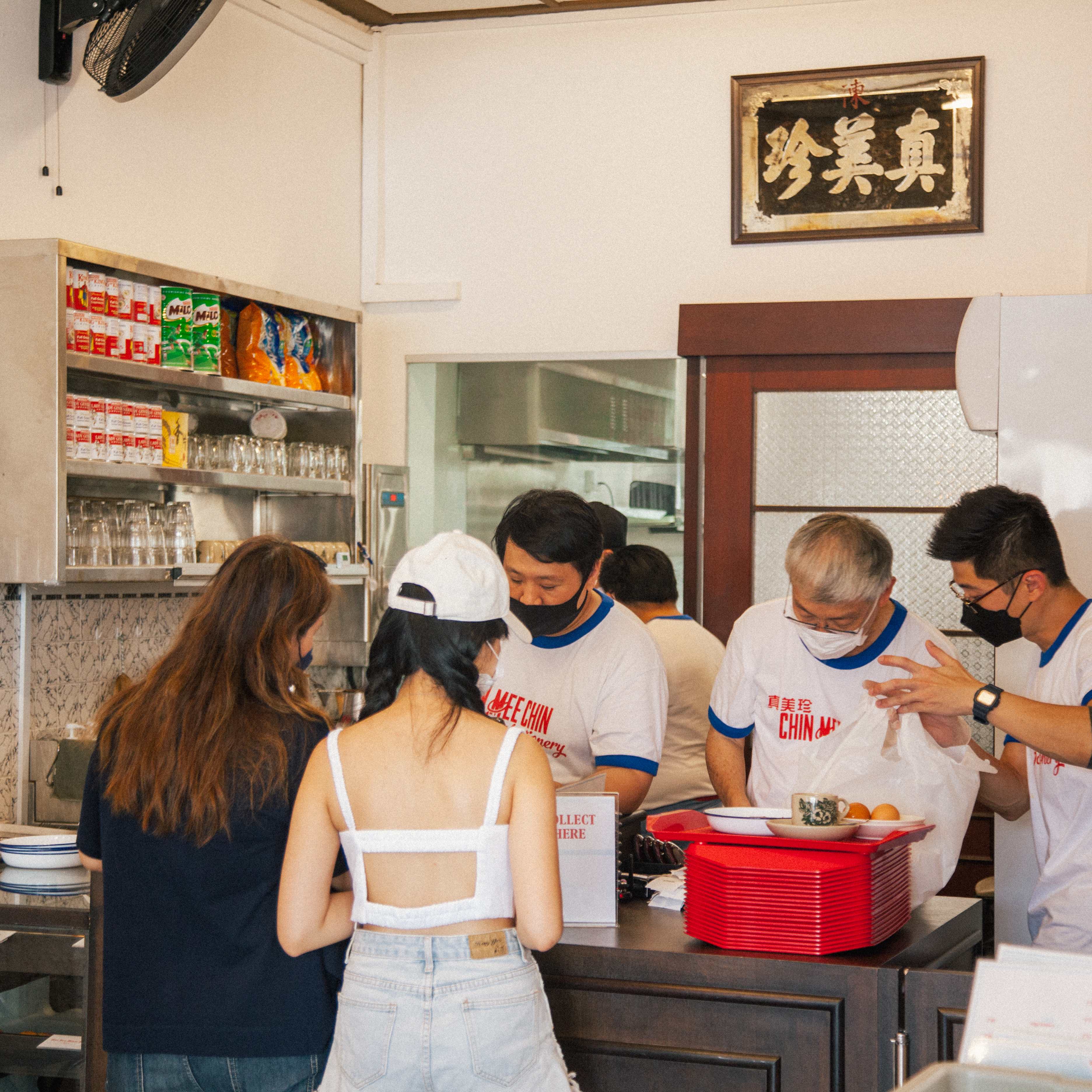
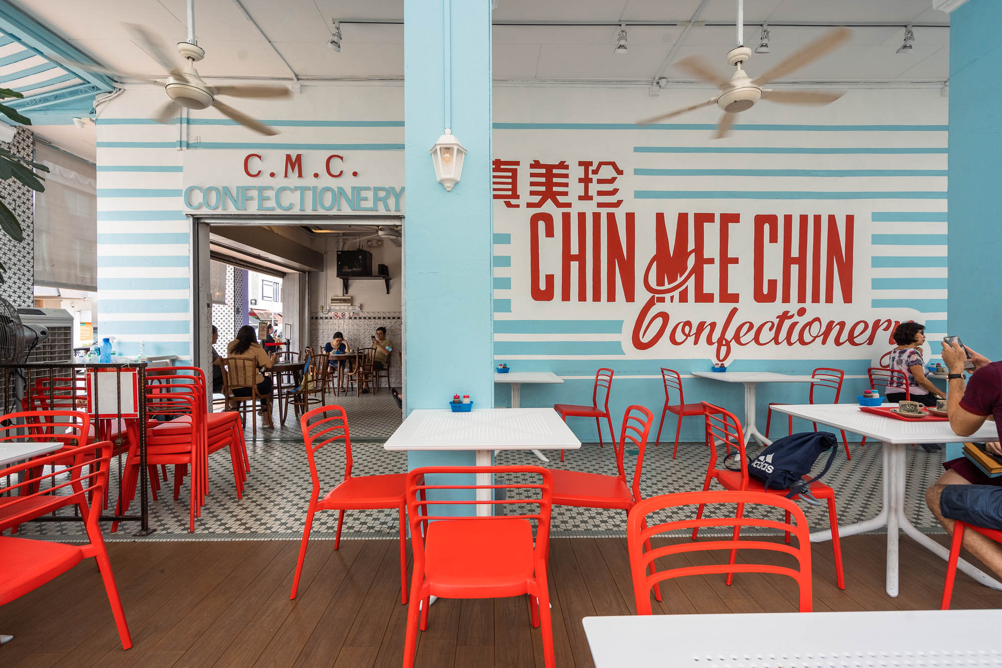
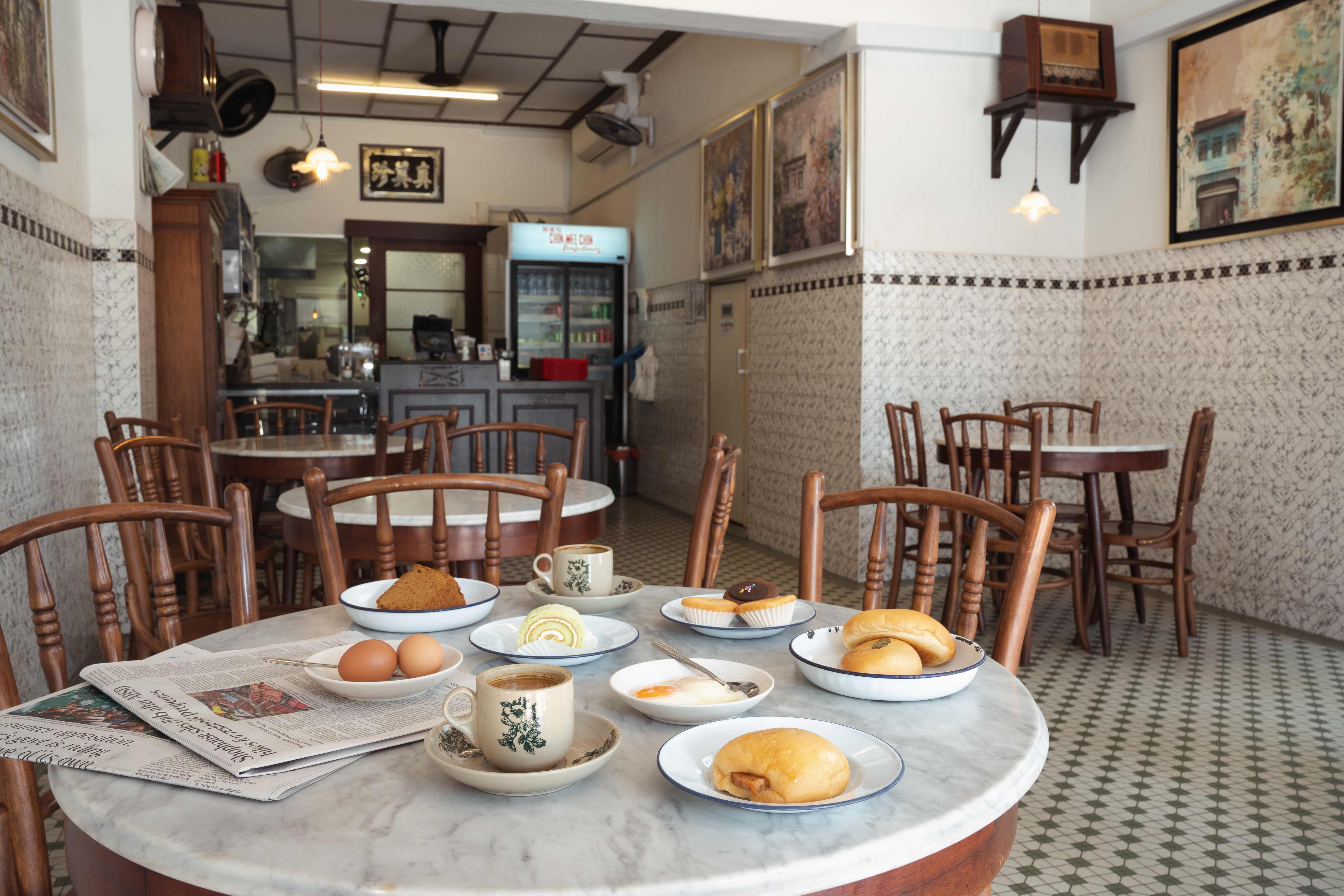
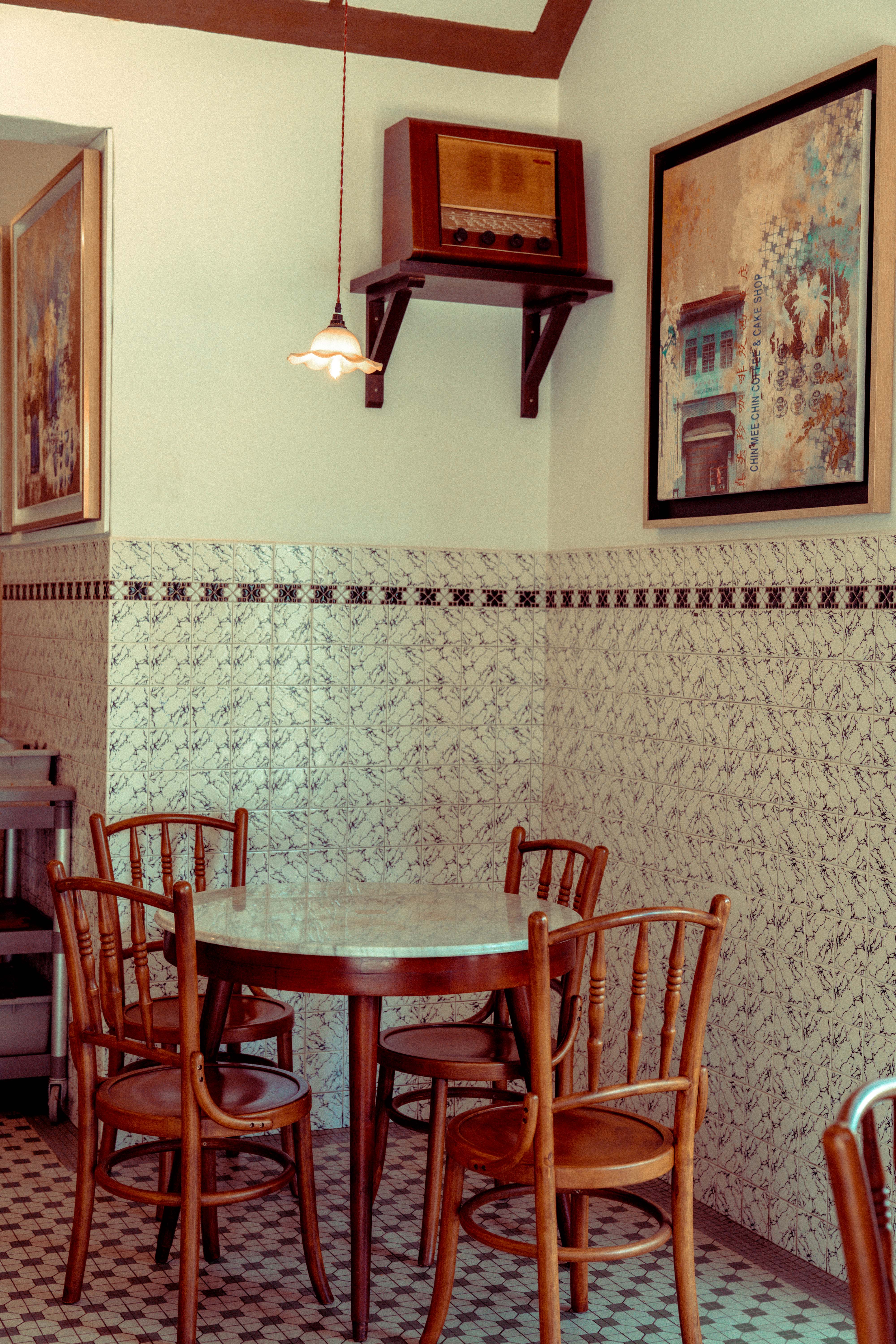
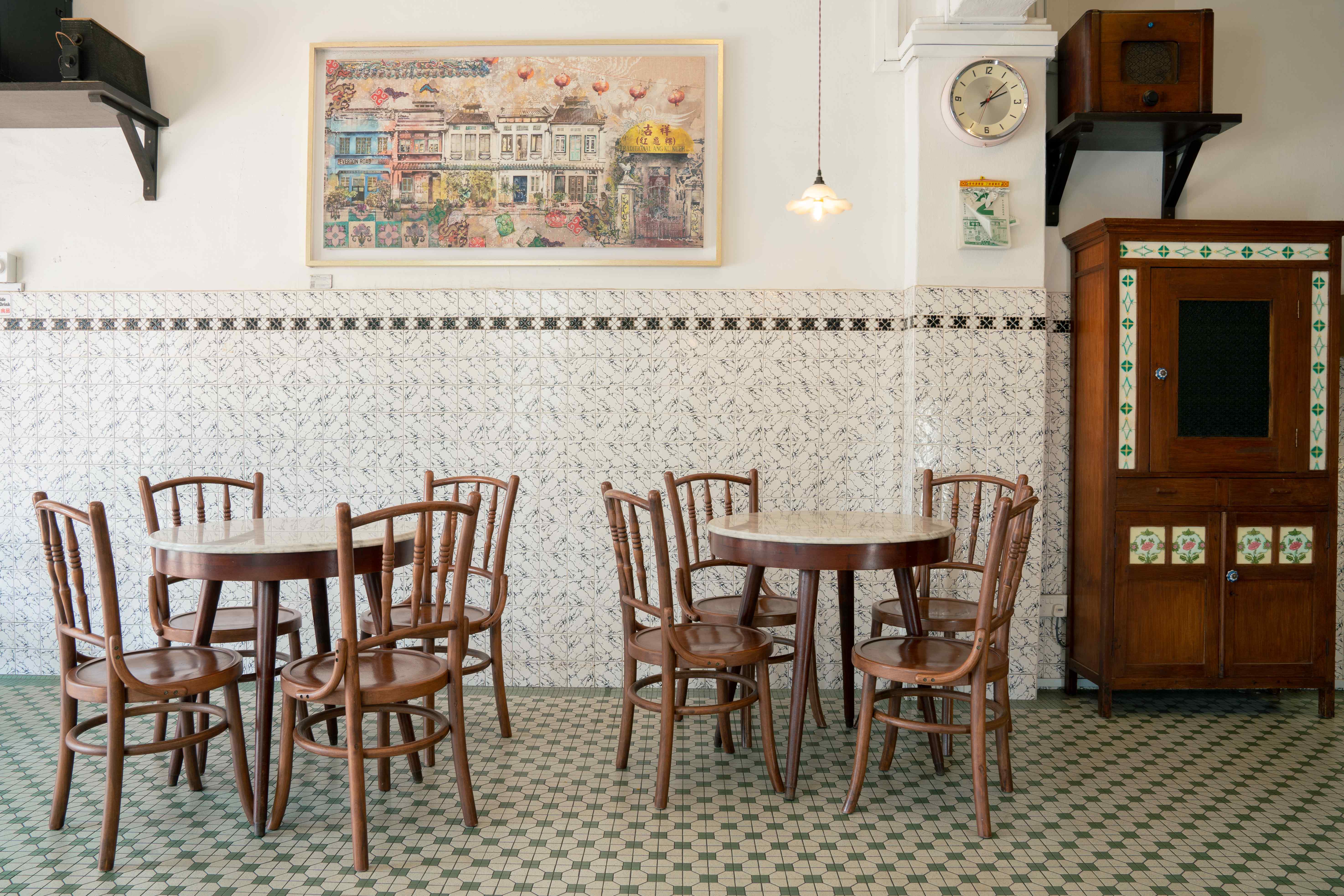
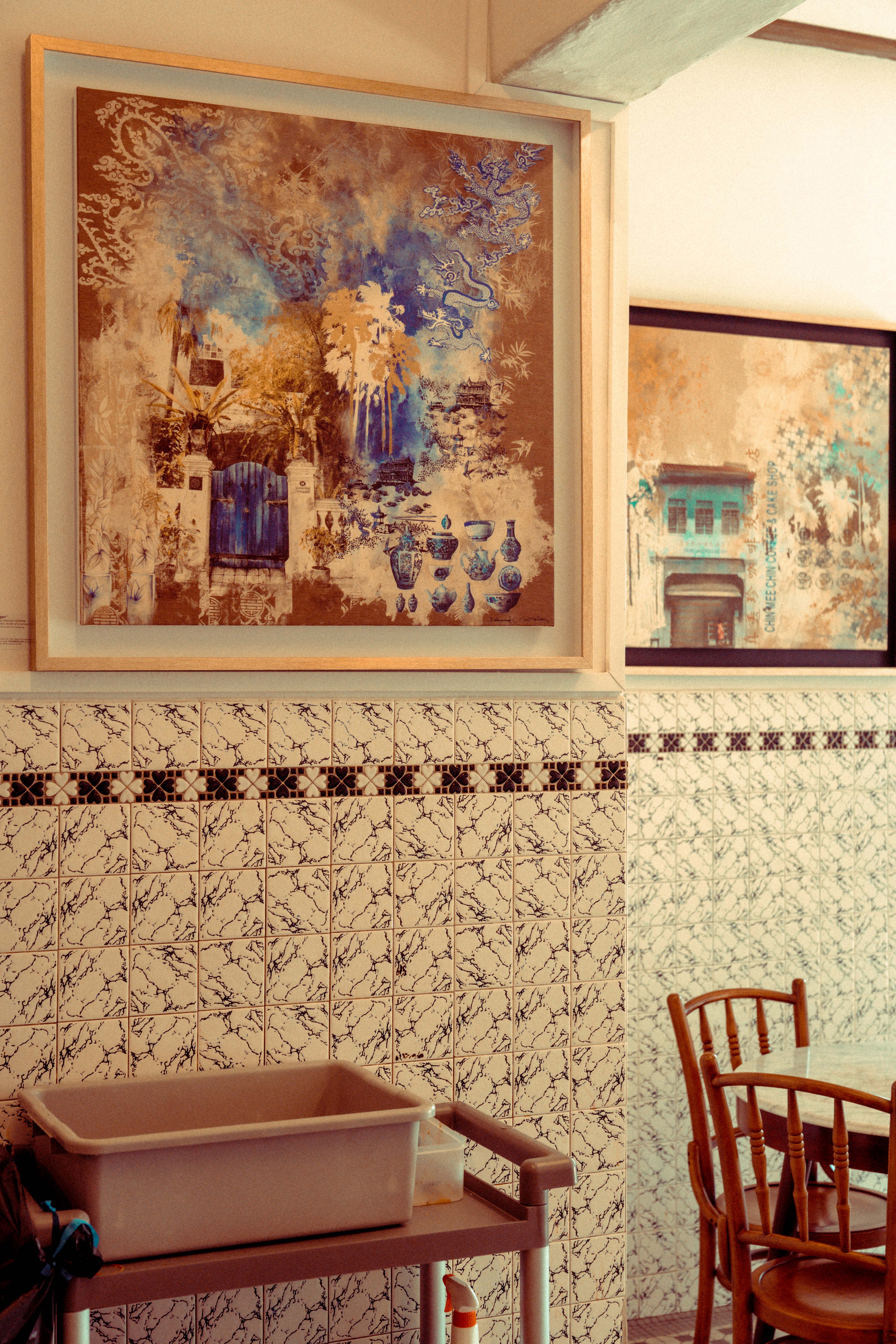
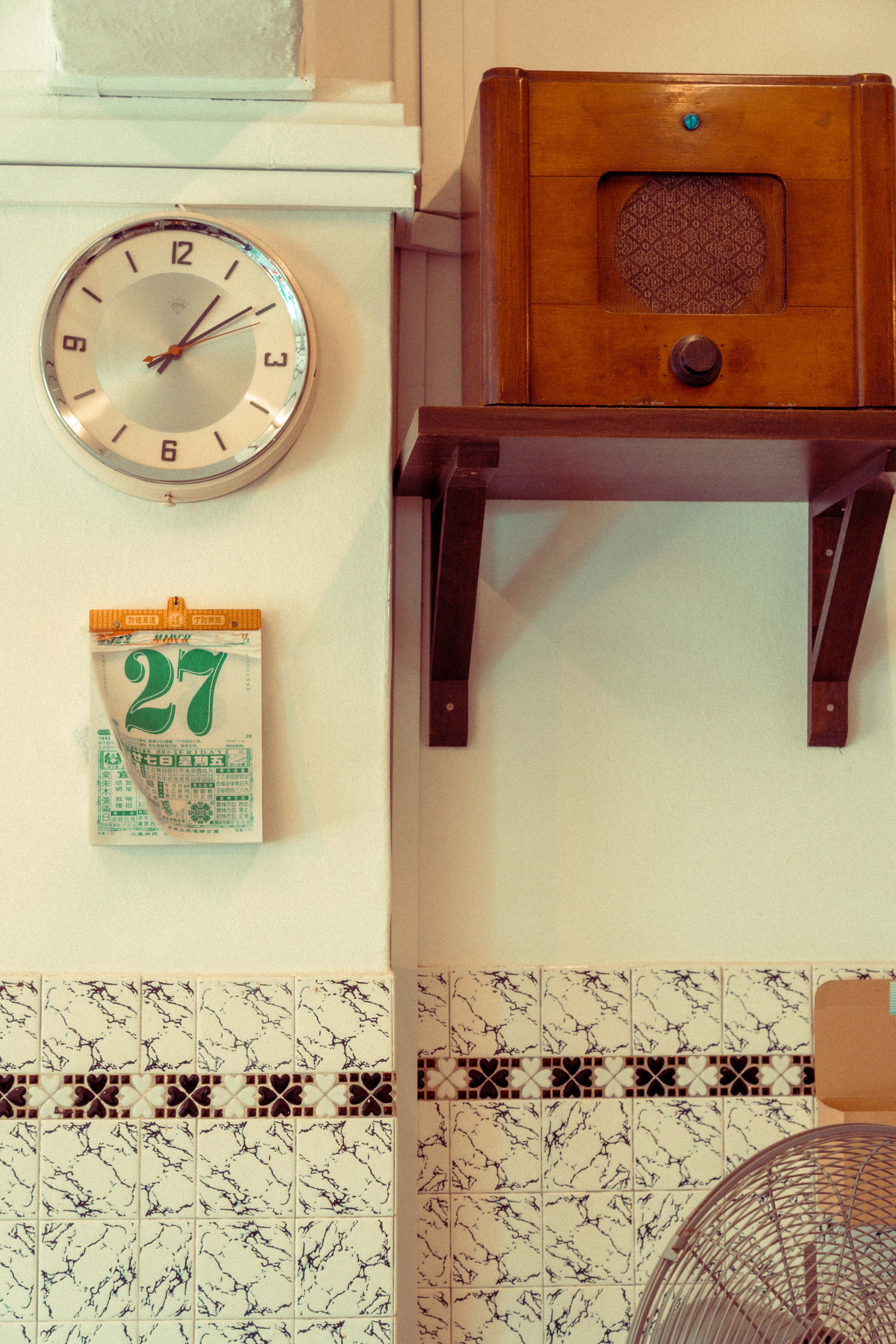
Some places are woven into the fabric of a city. Chin Mee Chin is one of them. Rather than rewriting its story, the design preserves the café's timeworn interiors and draws from the wider cultural fabric of its time such as old cafe designs, signboards, vintage packaging, and familiar details to gently carry a beloved institution into the present.
- Creative Direction
- Norman Hartono
- Graphic Designers
- Dillon Tan, Faiye del Rosario
- Build
- Furnisteel Pte. Ltd.
01 — Interiors / Past in Present Tense
Past in Present Tense
02 — Identity Marks
Logo


03 — Color Palette
Color
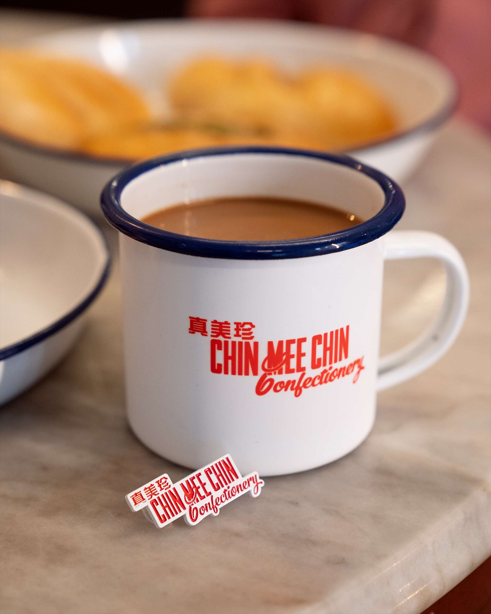
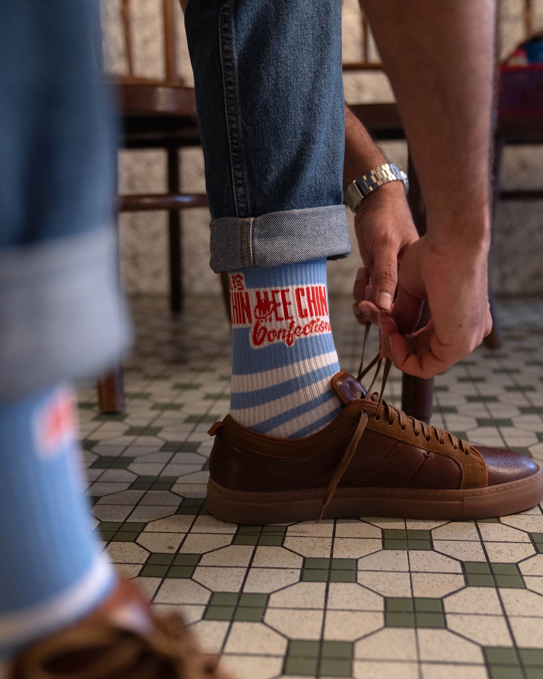
CMC's palette is pulled directly from the café itself — the Ruby red of its signage and trays, the Seaside blue of its walls and uniforms, and the clean white of its enamelware. Kopi brown and Cream anchor the warmer heritage notes beneath.
04 — Typography
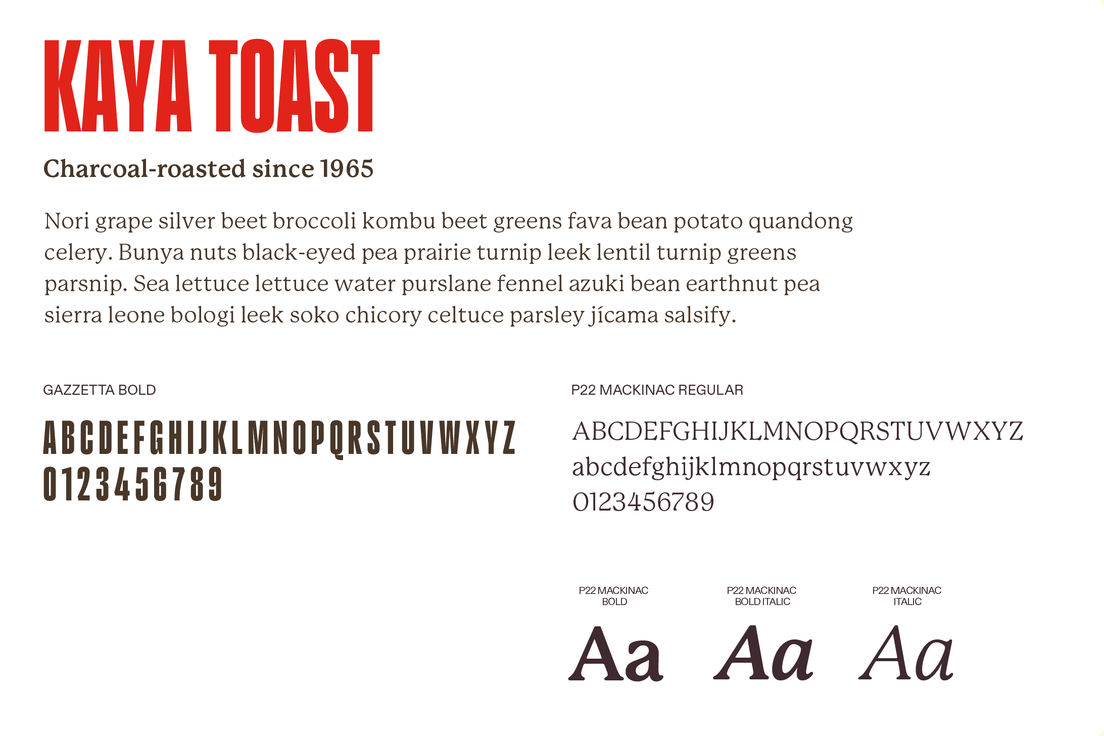
Typography
05 — Art Direction
Crafted From History
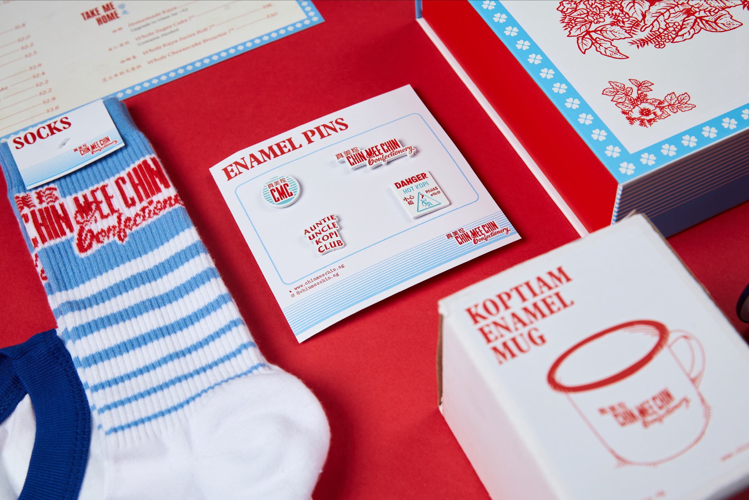
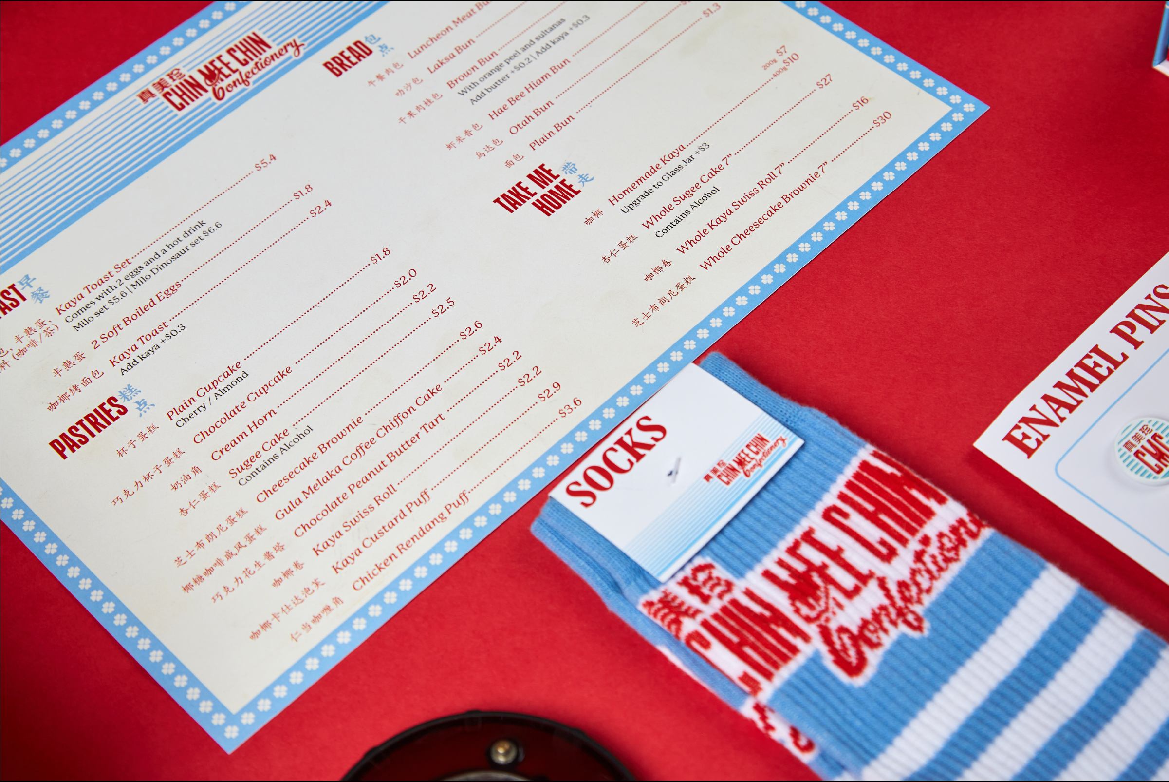
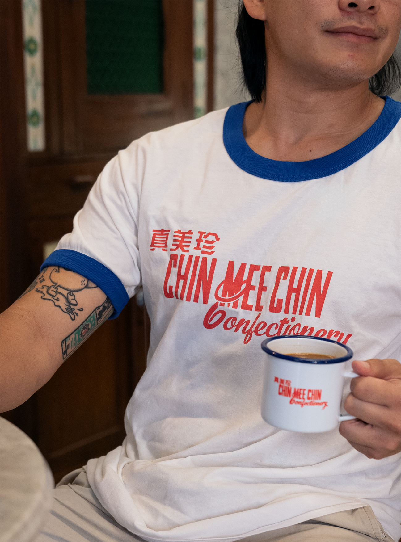
Rooted in Chin Mee Chin's original design, the project draws from the wider cultural fabric of its time.
06 — Branding
Branding