Brand Identity & Spatial Design
Café Natsu
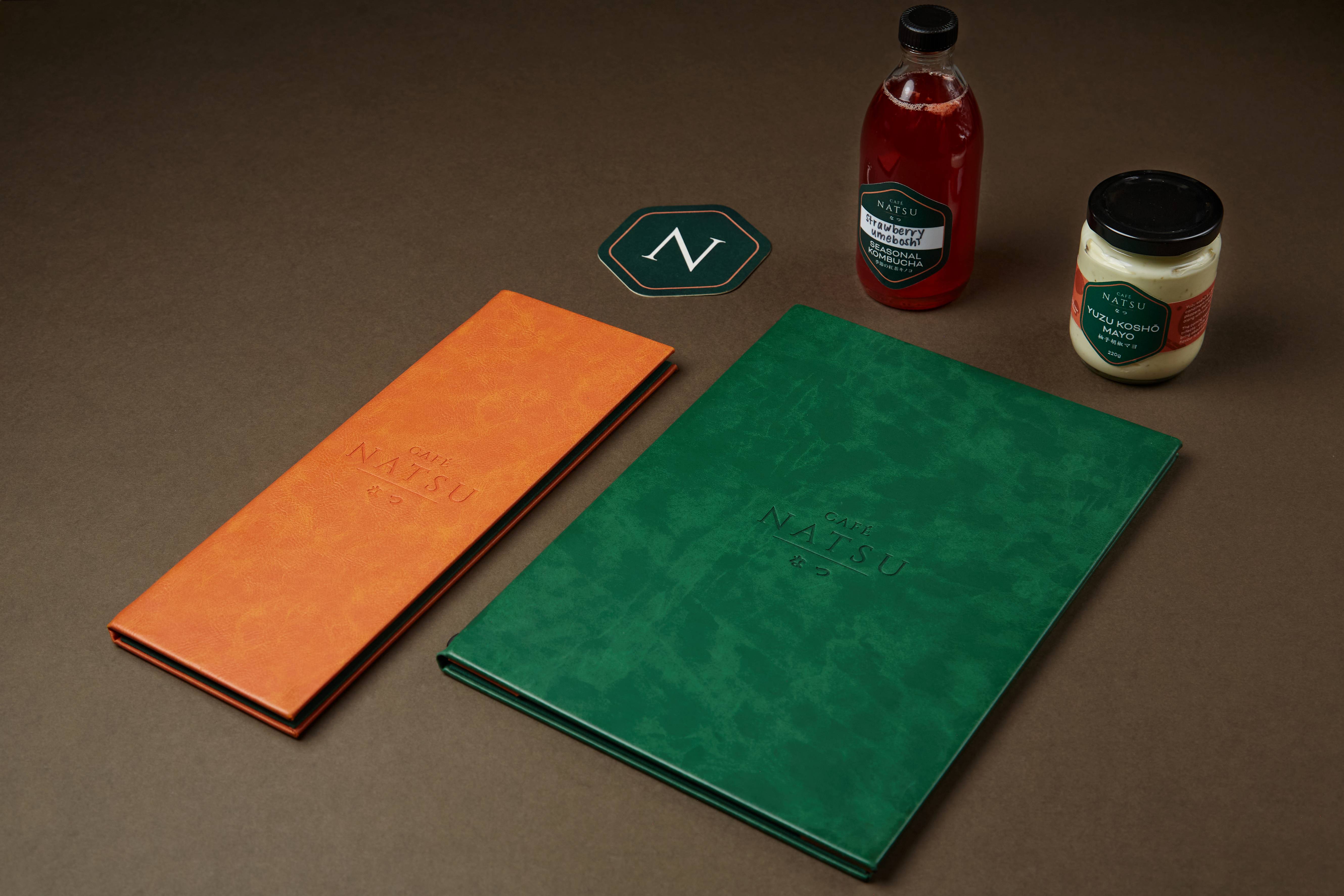
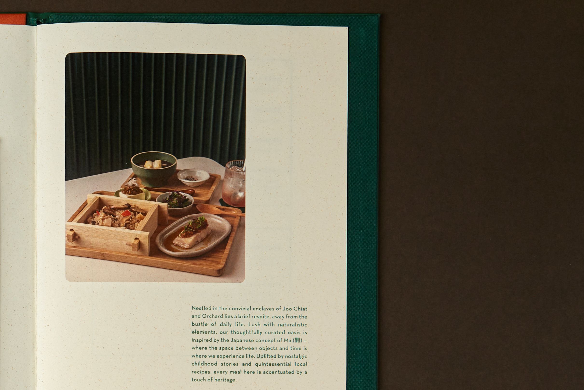
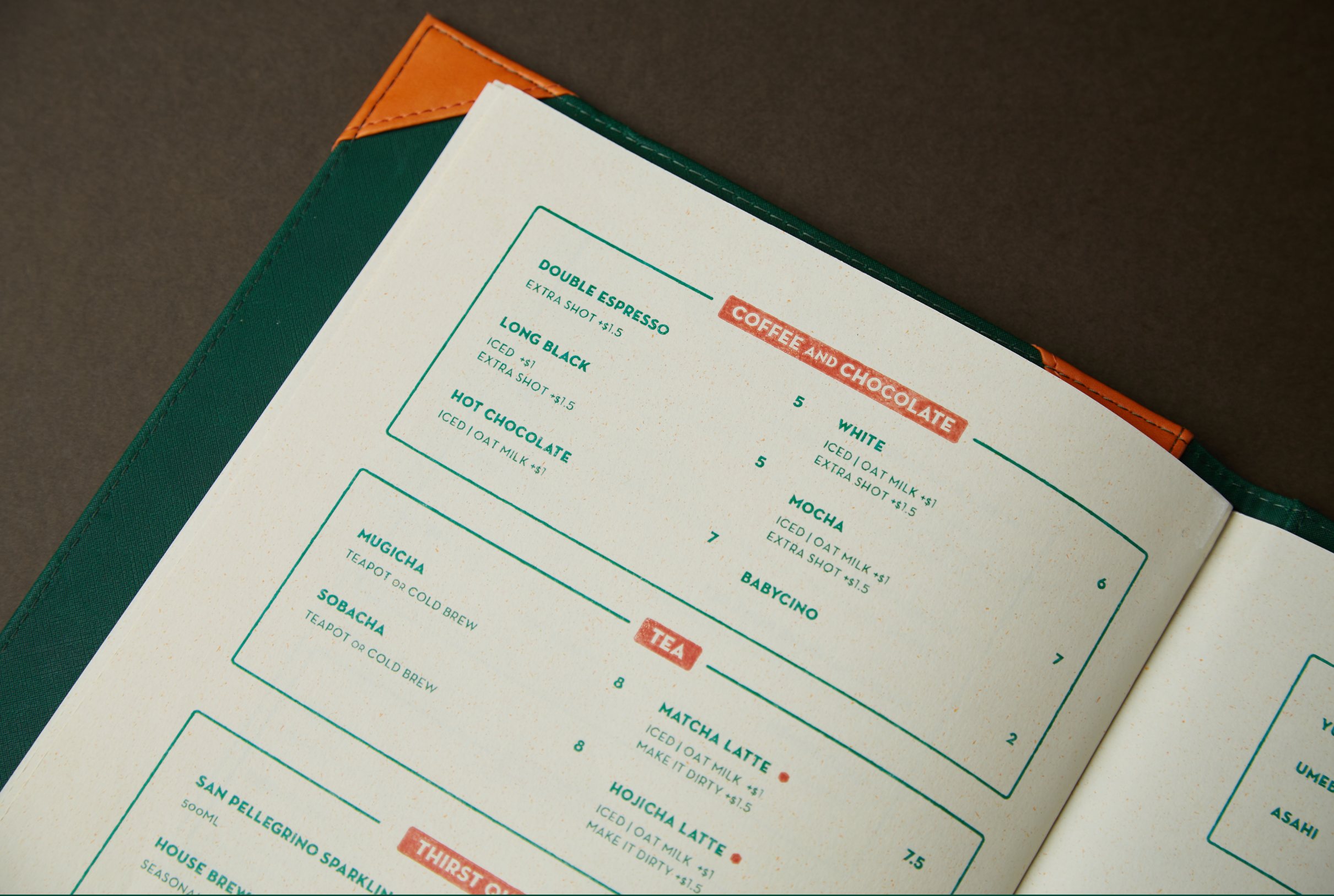
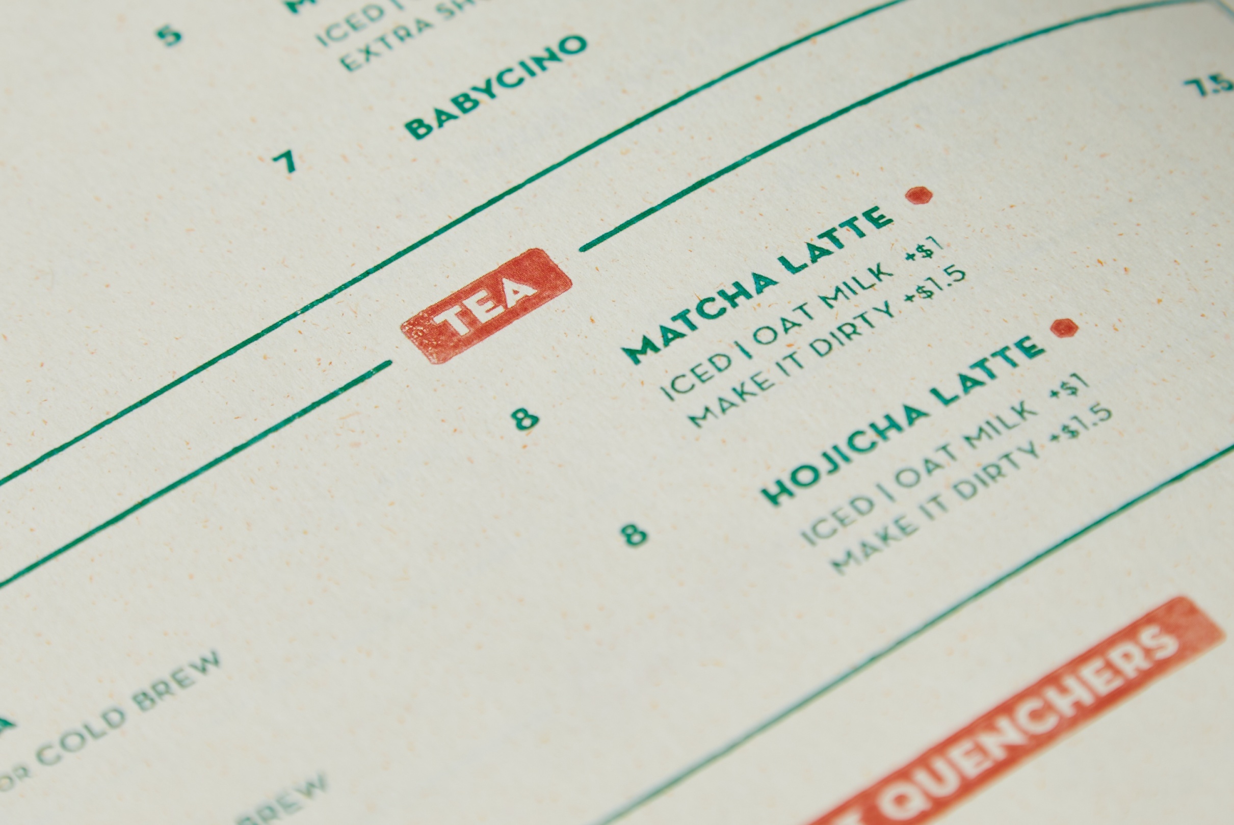
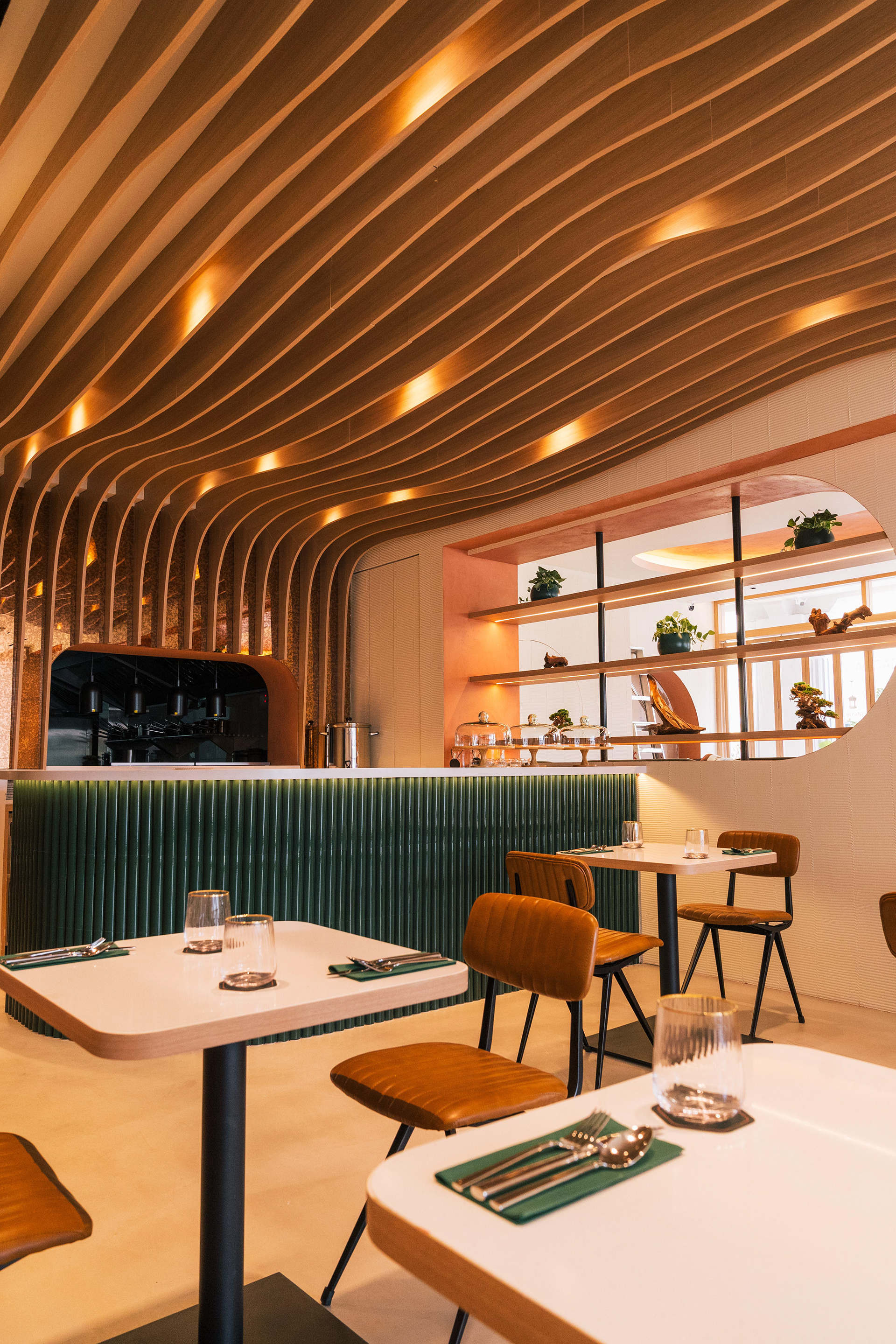
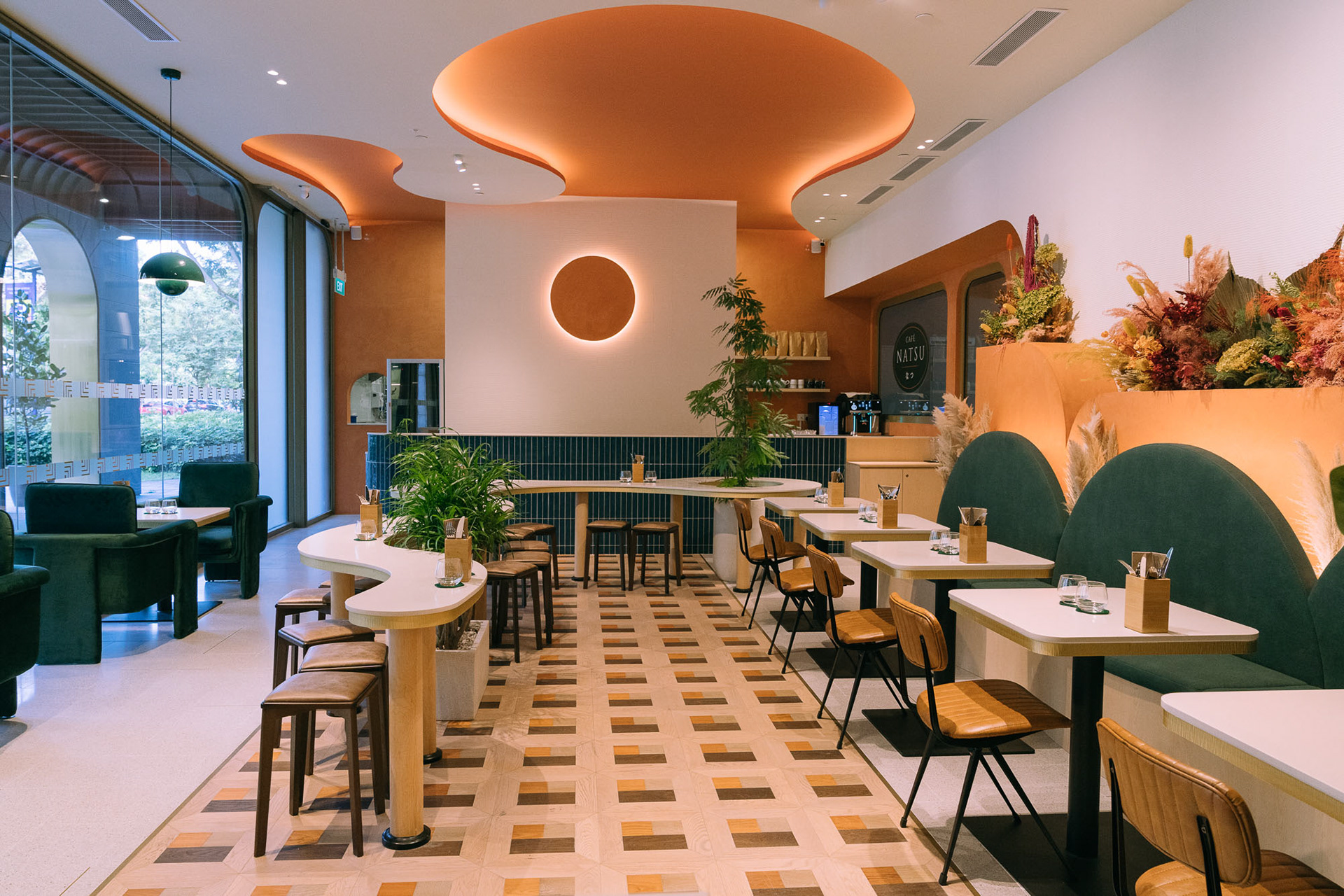
Café Natsu brings together the quiet restraint of Japanese design with the warmth of European brunch culture. Bold colours, expressive typography, and tactile print details create an identity that celebrates simplicity, craftsmanship, and the beauty of considered design.
- Creative Direction
- Norman Hartono
- Graphic Designers
- Dillon Tan, Faiye del Rosario
- Drafting & Build
- FIDE ID Pte. Ltd.
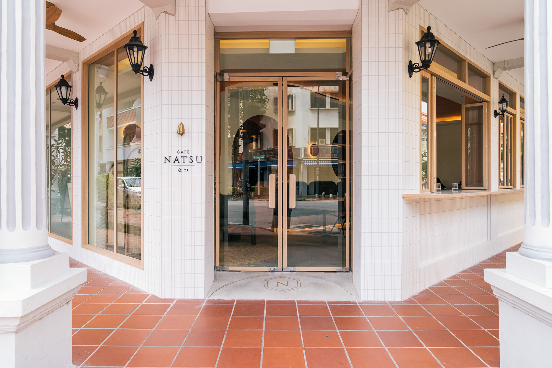
01 — Interiors / Spatial Design
Spatial Design
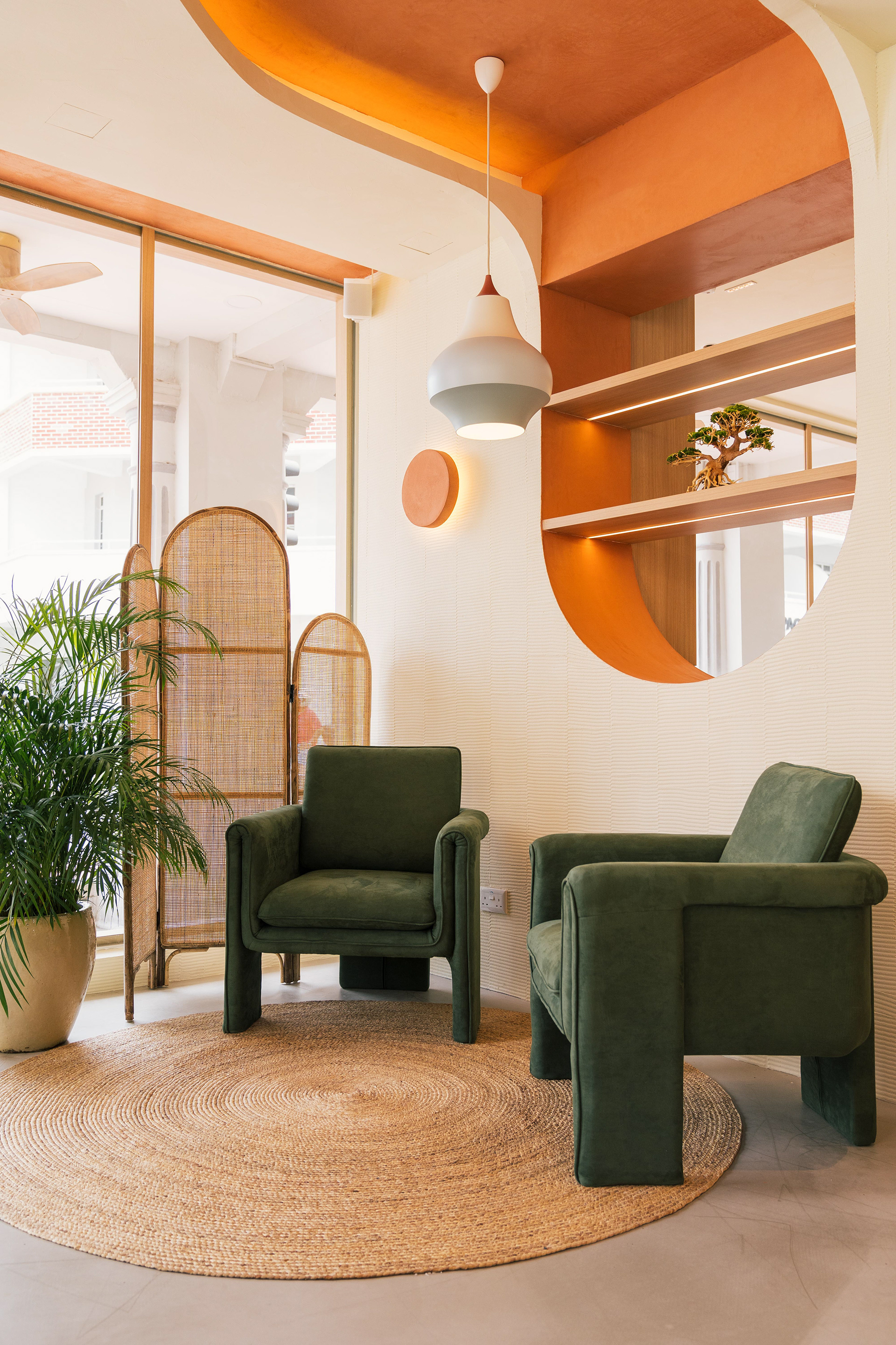
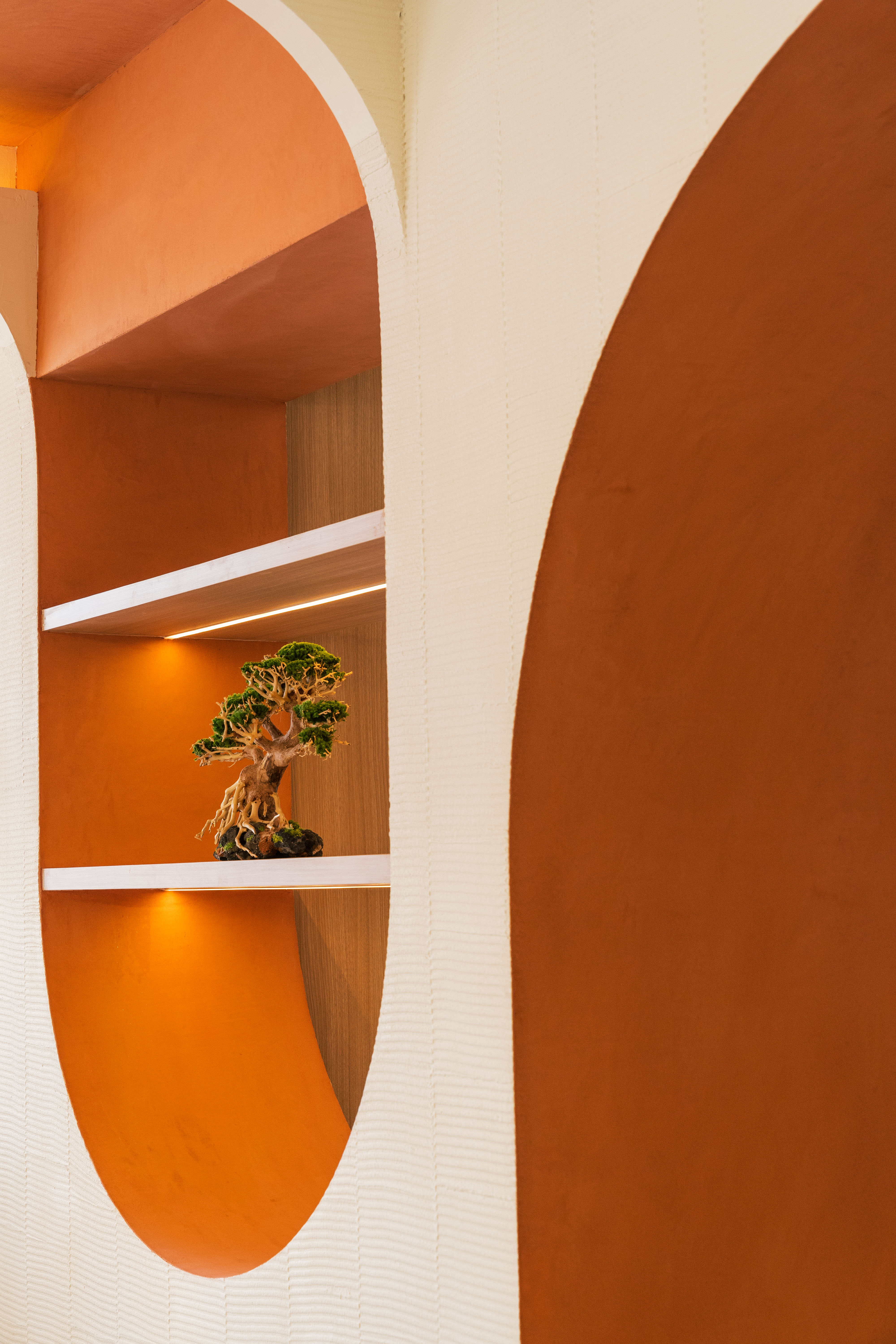
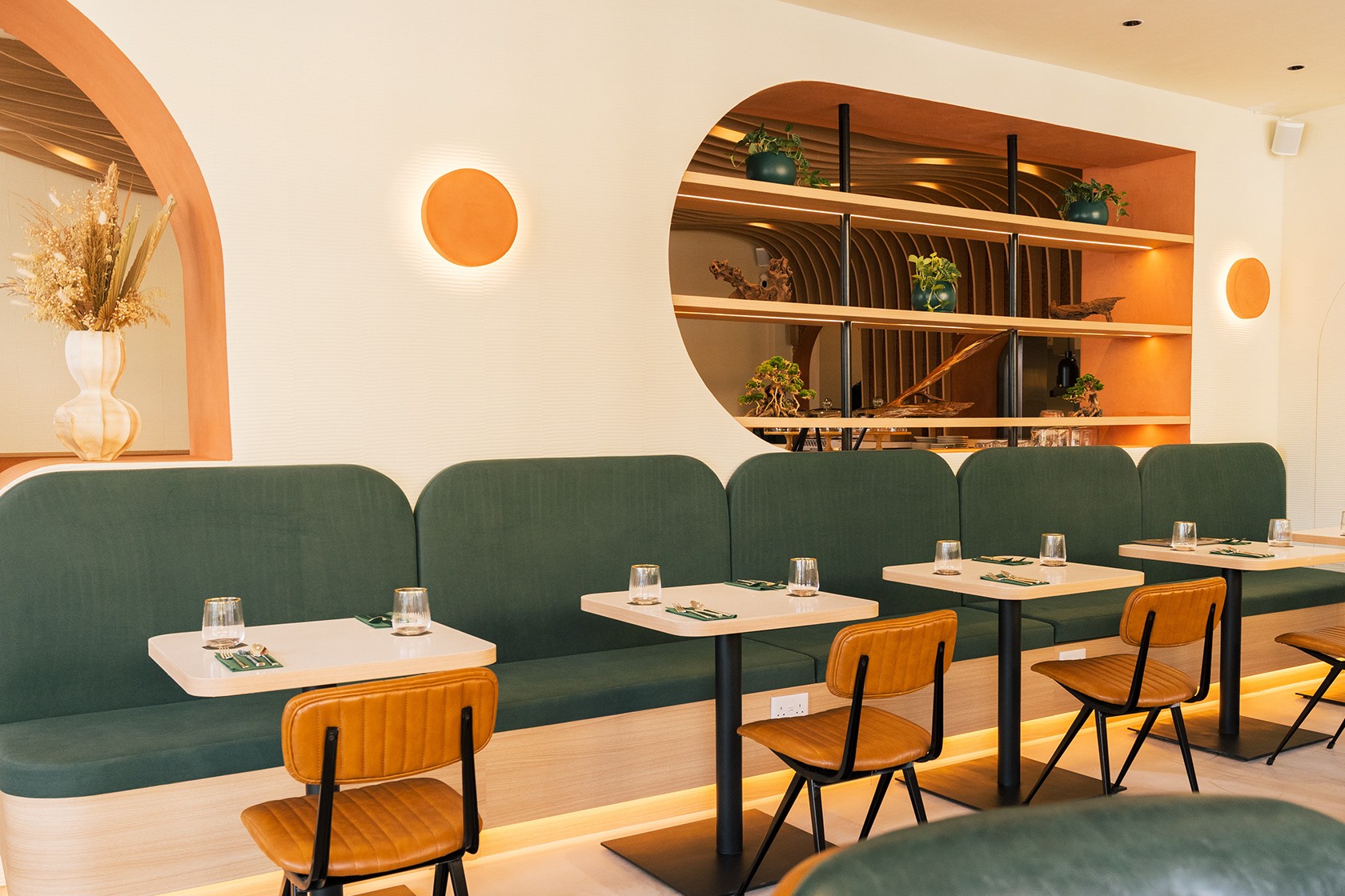
02 — Identity Marks
Logo
03 — Color Palette
Color
Natsu's palette draws directly from its interiors — the deep Emerald of the booth seating and tiled bar, the warm Coral of the arched ceilings and accent walls, and a soft Cream that runs through the menus, walls, and tableware. Together they hold both the Japanese restraint and European warmth the brand was built on.
Primary
HEX #006241Emerald
Primary
HEX #D47455Coral
Secondary
HEX #FFF1D5Cream
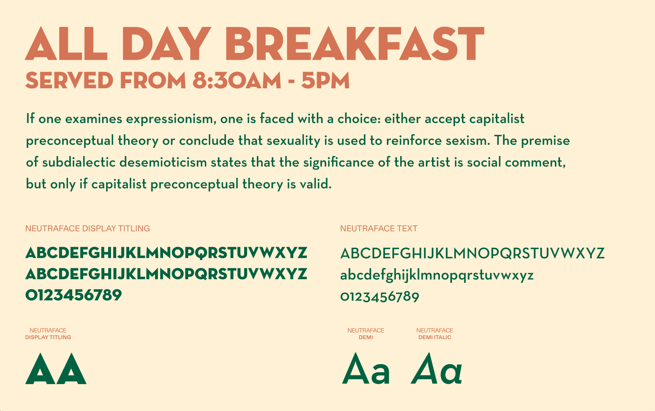
04 — Typography
Typography
05 — Branding
Branding